Events & webinar directory builder
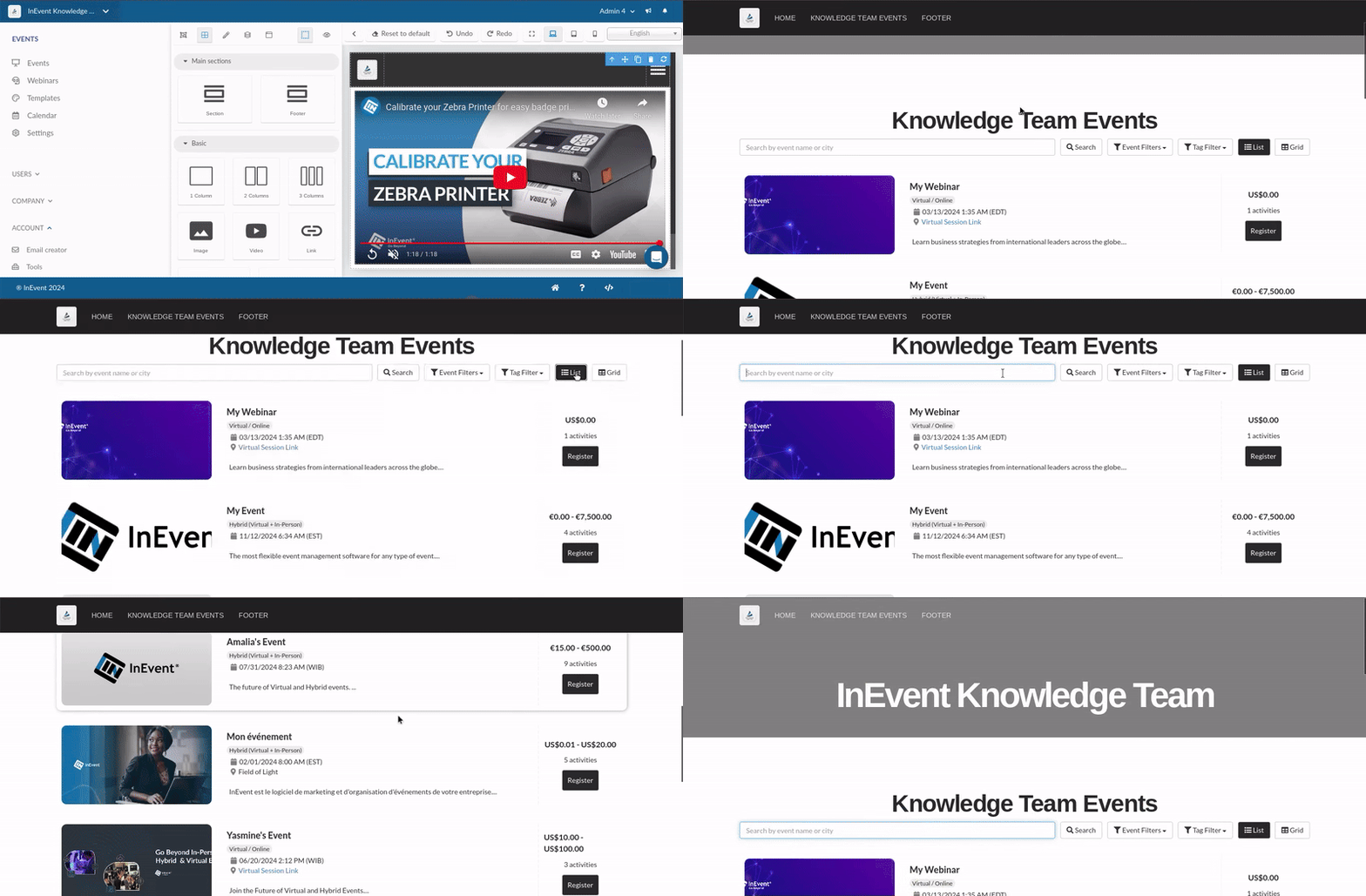
The InEvent platform provides a Directory for events and webinars, which allows event organizers to easily display events on one unified website for convenient viewing. In addition, event organizers can also build and customize their own directory using the Directory builder with ease.
This article contains information on enabling the directory builder, configuring directory pages, and further enhancing the directory.
Enabling the Directory builder feature
Before using the directory builder, ensure that you have enabled the tool at the Company level. To do so, follow the steps provided below.
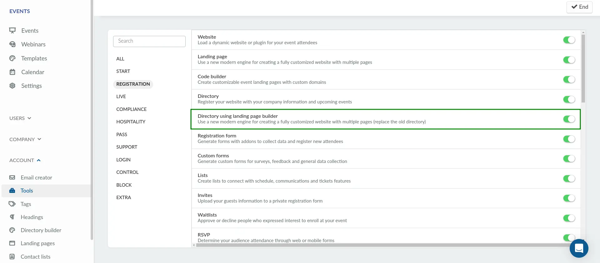
- Navigate to Account > Tools from the Company level.
- Click on Edit.
- Enable the Directory using landing page builder tool within the Registration section using the corresponding toggle.
- Click on End to save your changes.
After completing the steps above, you can start using the directory builder.
Directory builder
To use the directory builder, navigate to Accounts > Directory builder from the Company level. In this page, you will find a preview of your directory as well as a menu bar on top.
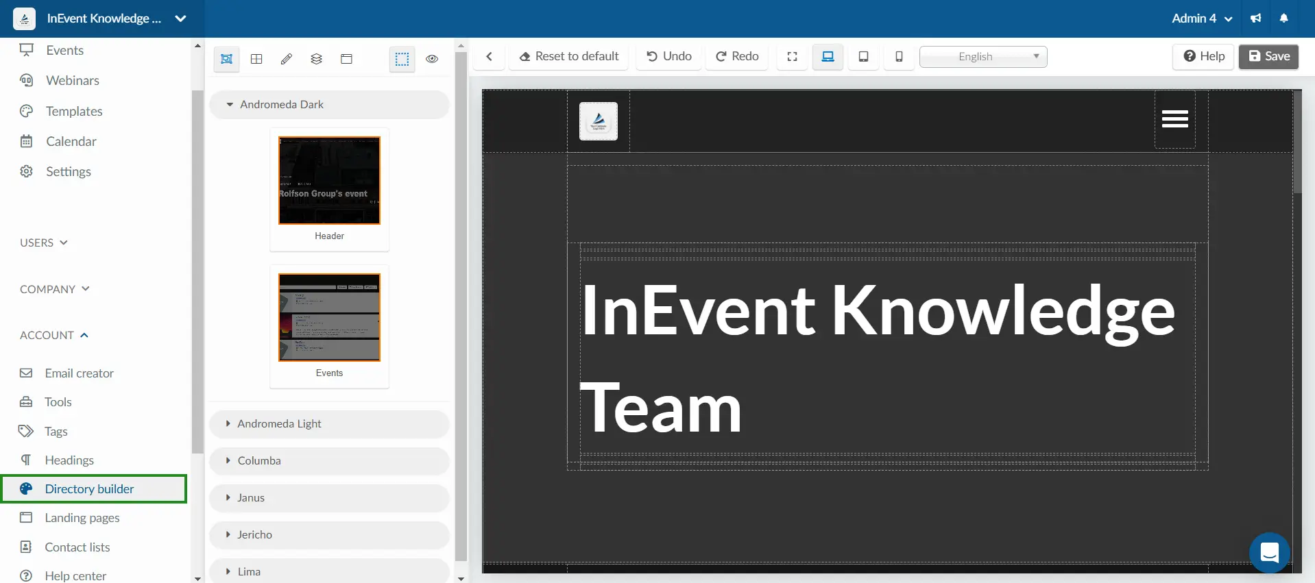
The top bar contains the following buttons:
Menu bar | The menu bar provides quick access to key features for configuring and previewing the directory. |
Toggle menu | Opens the directory configuration menu, containing the Sections, Components, Style editor, Layers, and Pages menus, on the left side of the screen |
Reset to default | Resets the directory to the default blank state |
Undo | Undoes the previous action |
Redo | Restores the previous action that was undone |
Expanded view | Displays a preview of the directory in extended desktop view |
Desktop view | Displays a preview of the directory in desktop view |
Tablet view | Displays a preview of the directory in tablet view |
Mobile view | Displays a preview of the directory in mobile view |
Language selector | Selects a language in which the directory will be previewed |
Save | Saves changes that have been made to the directory |
Sections
In the Sections menu, you can drag and drop sections into the directory preview. The following sections are available for use:
- Header: Displays the website's logo, the event's name and date, along with a navigation menu that lists all available sections, enabling users to navigate to different sections or pages of the site.
- Events: Displays the events in your company, showing the number of activities within each event, the ticket prices, and providing the option to register for events.
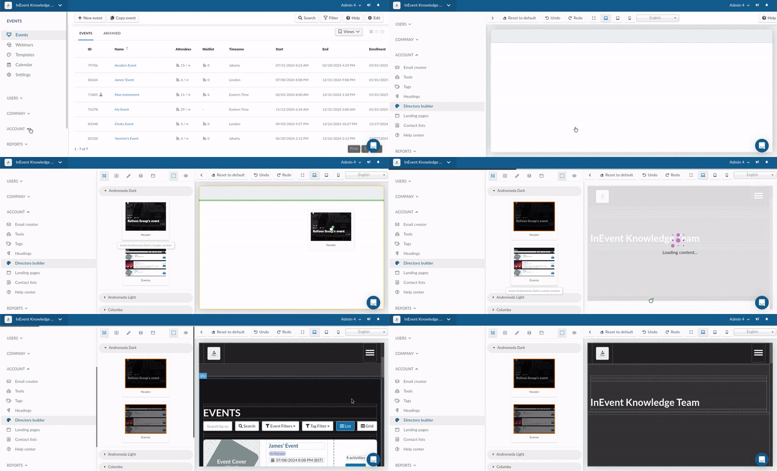
The sections are available in the following templates:
- Andromeda Dark
- Andromeda Light
- Columba
- Janus
- Jericho
- Lima
Removing sections
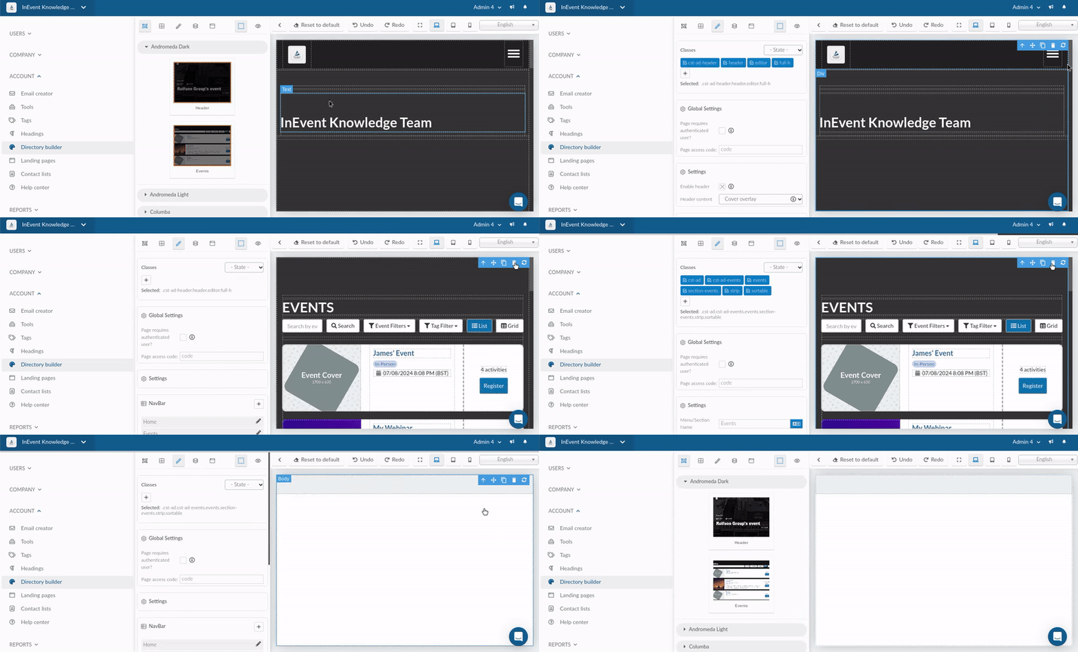
In order to remove a section, click on the target section. Then, click on the trash icon on the top right corner of the section. After doing so, the section will be removed.
Changing section templates
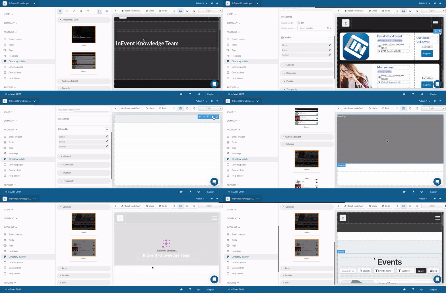
In order to change a section template, remove the existing section. Then, add the section with the desired template into the directory.
Components
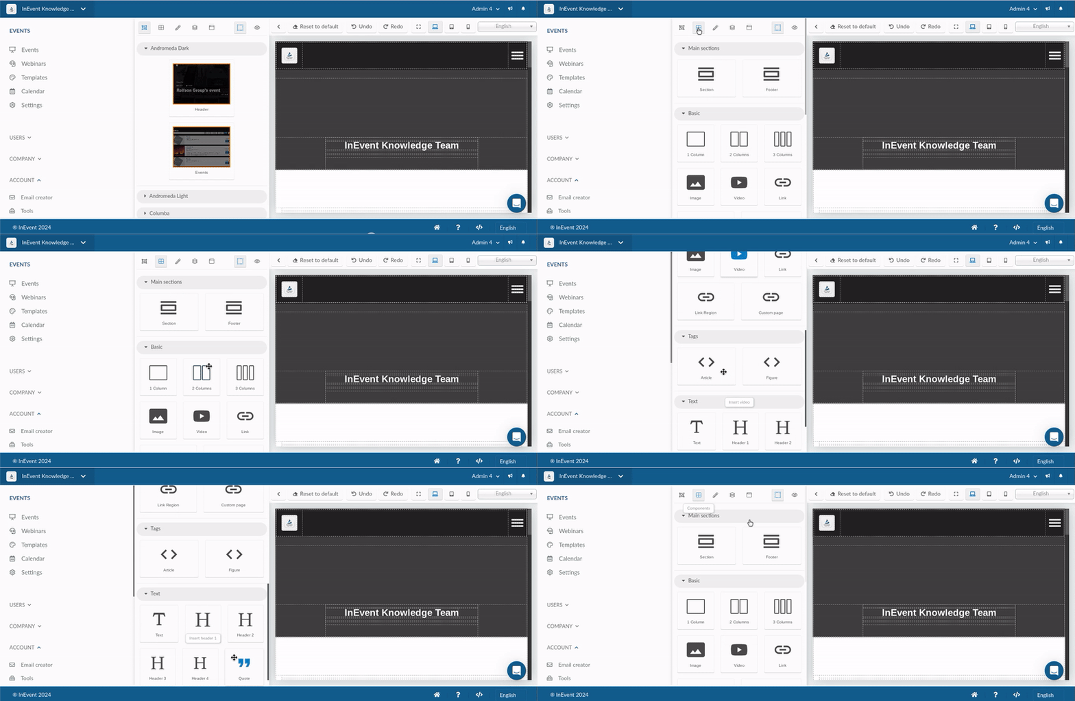
In the Components menu, you can select and add new components to the directory. This allows you to create text blocks, photos, videos, link region, and more.
Main section
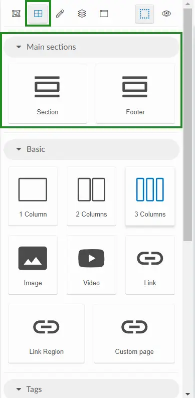
The following items are available within Main section category:
- Section : Generic sectioning element which corresponds to the
<section>HTML element. - Footer : Generic footer which corresponds to the
<footer>HTML element.
Basic
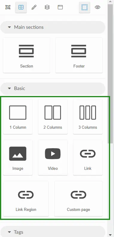
The following items are available within the Basic category:
- 1 Column: Column which can further contain components, such as text blocks, images, videos, links, and more.
- 2 Columns: Two columns that can further contain components.
- 3 Columns: Two columns which can further contain components.
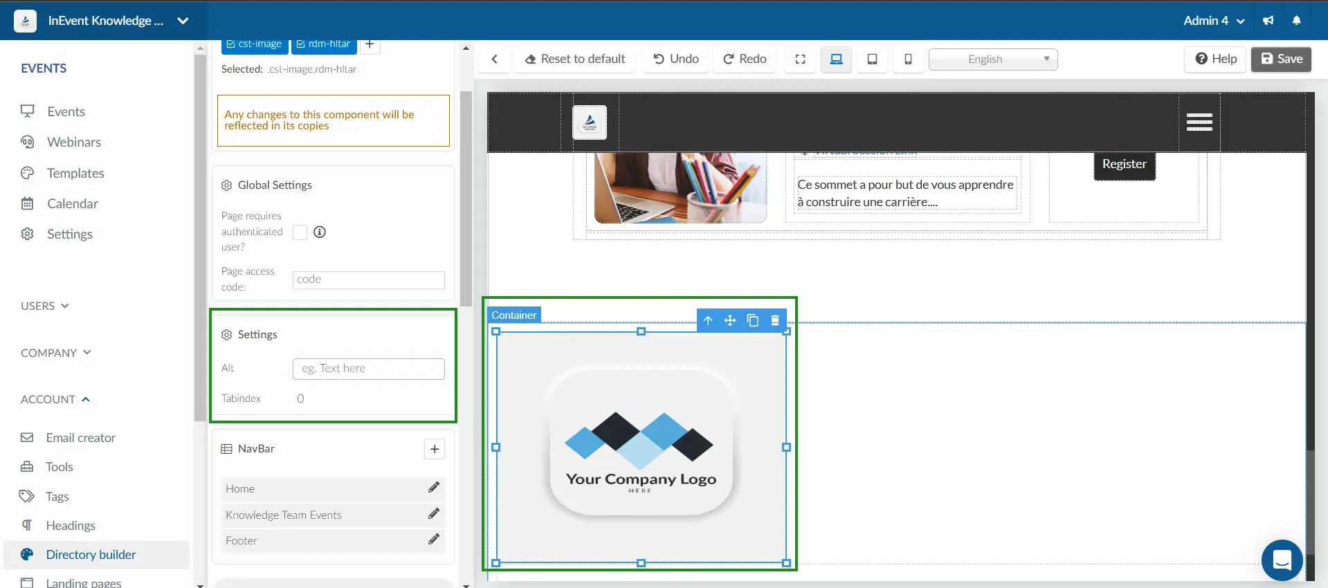
- Image: Inline image sourced from your computer. Previously uploaded images will also be available for selection. You can further configure the image's CSS properties and add ALT text by clicking on the image and going through the Settings menu. For more information, refer to the section on image properties.
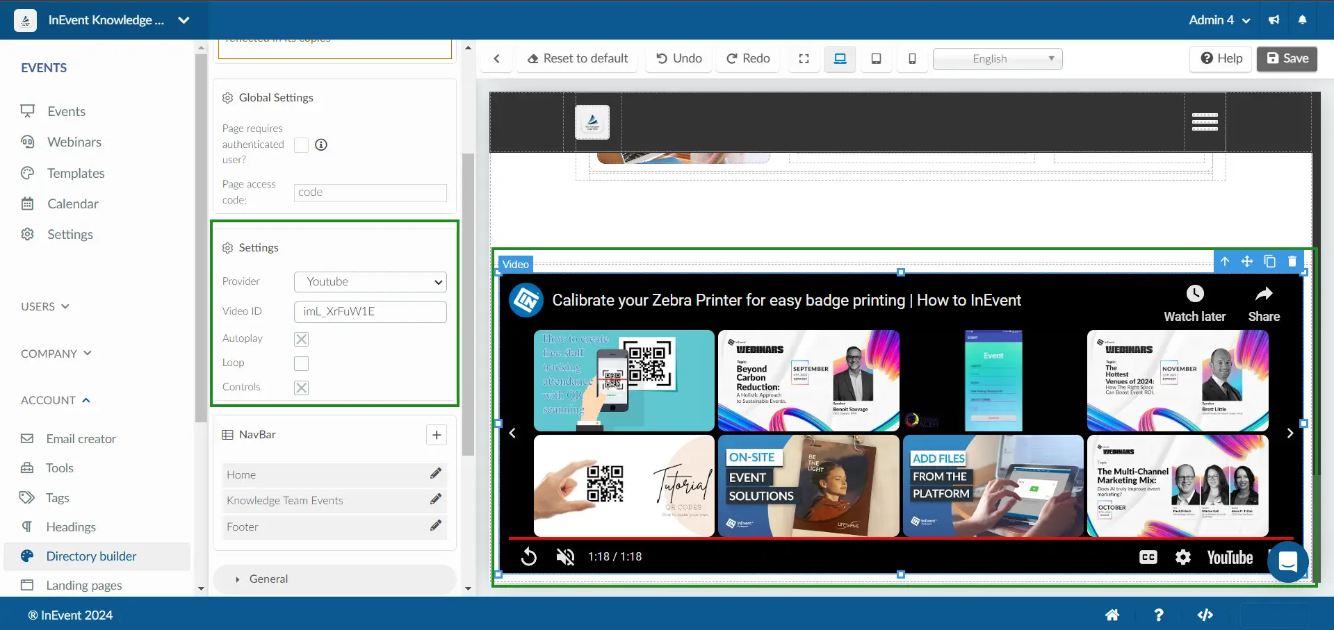
- Video: Inline video sourced from an HTML5 source or online video providers. You can further define an autoplay rule and select your desired thumbnail image. For more information, refer to the section on embedded videos.
- Link: Inserts an inline link.
- Link region: Inserts a link region
- Custom page: Inserts a custom directory page
Tags
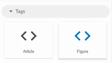
The following items are available within the Tags category:
- Article: Self-contained, independent element corresponding to the
<article>HTML element. Best used for text blocks. - Figure: Self-contained, independent element corresponding to the
<figure>HTML element. Best used for images or videos.
Text
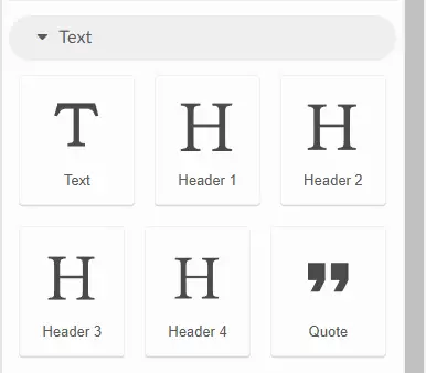
The following items are available within the Text category:
- Text: Simple text block.
- Header 1-4: Four level of headings corresponding to
<h1>,<h2>,<h3>, and<h4>HTML elements. - Quote: Text enclosed as an extended quotation corresponding to the
<blockquote>HTML element.
Style editor
In the Style editor menu, you can customize the styles and properties of the selected element. This allows you to configure an element's click and hover styles, the directory global setting, navigation bar items, as well as properties such as height, width, borders, and more.
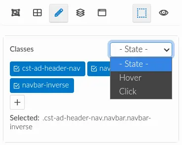
Classes
Defines the state of the selected element classes. The available options are Hover and Click.
Global settings
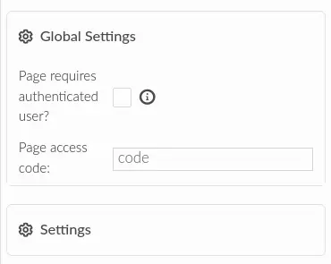
The Global settings menu contains options related to the directory's access policy. The options are listed as follows:
- Page requires authenticated user?: Checkbox to define whether the directory is only accessible to authenticated or logged in users.
- Page access code: Field to define a 4-number code needed to access the directory. If left empty, the directory will be accessible without the access code.
Section settings
The Section settings menu contains settings specific to the sections provided by InEvent.
To access the section Settings, you must first select a specific section, such as the Header Section or the Events Section. Once a section is selected, go to the Settings tab in the menu and click on Open this section settings to view and edit the section's settings.
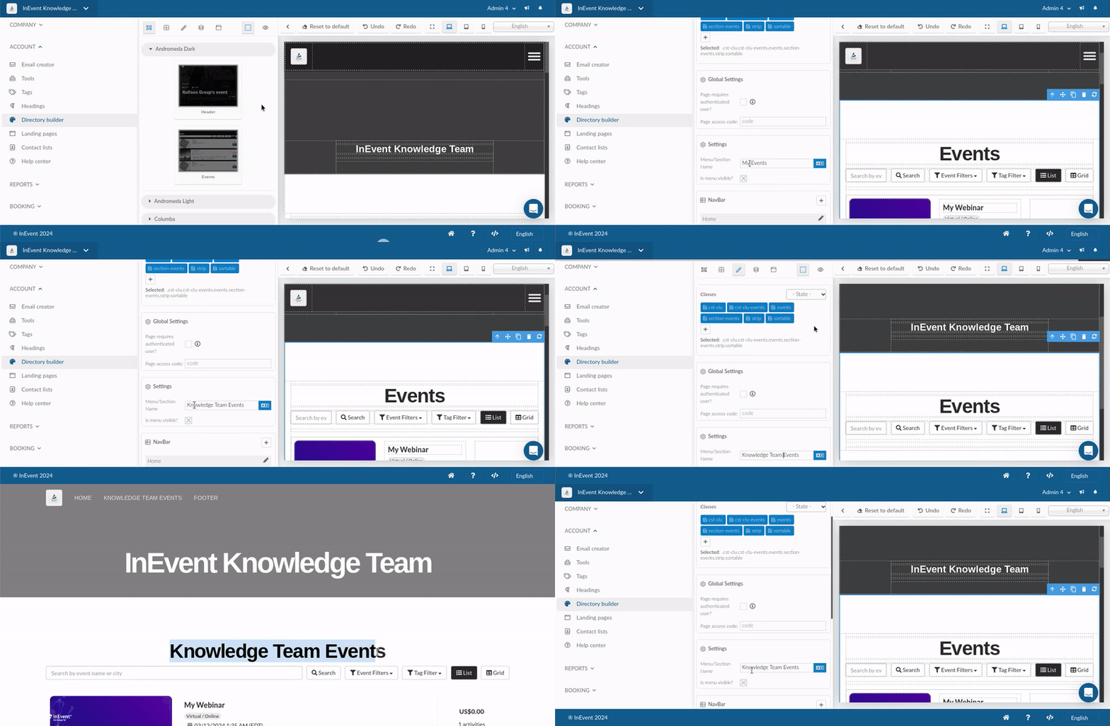
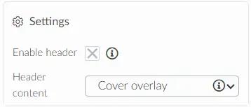
The following settings are available for the Header section:
Enable header: This is enabled by default. You can untick the checkbox to hide the header.
Header content: The header content offers two options:
- Cover Overlay: Displays your company name and cover.
- Invisible: Hides both the company name and cover.
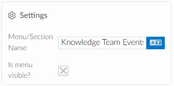
The following settings are available for the Events section:
Menu/Section Name: Allows you to rename or edit the title of the event section and define how the section name is displayed in the navigation menu.
Is menu visible?: This allows you to disable or enable the menu.
Settings
The Settings menu allows you to modify element-specific settings when custom elements are selected. You can, for example, add ALT text to an image or modify the properties of a video element.
Image settings: The image settings allow you to add alt text to your images and assign a tab index.
Embed video settings: The embedded video settings allow you to select the provider, with YouTube, Vimeo, and HTML5 as the available sources. You can also configure options such as enabling or disabling autoplay, setting videos to loop, and enabling or disabling video controls.
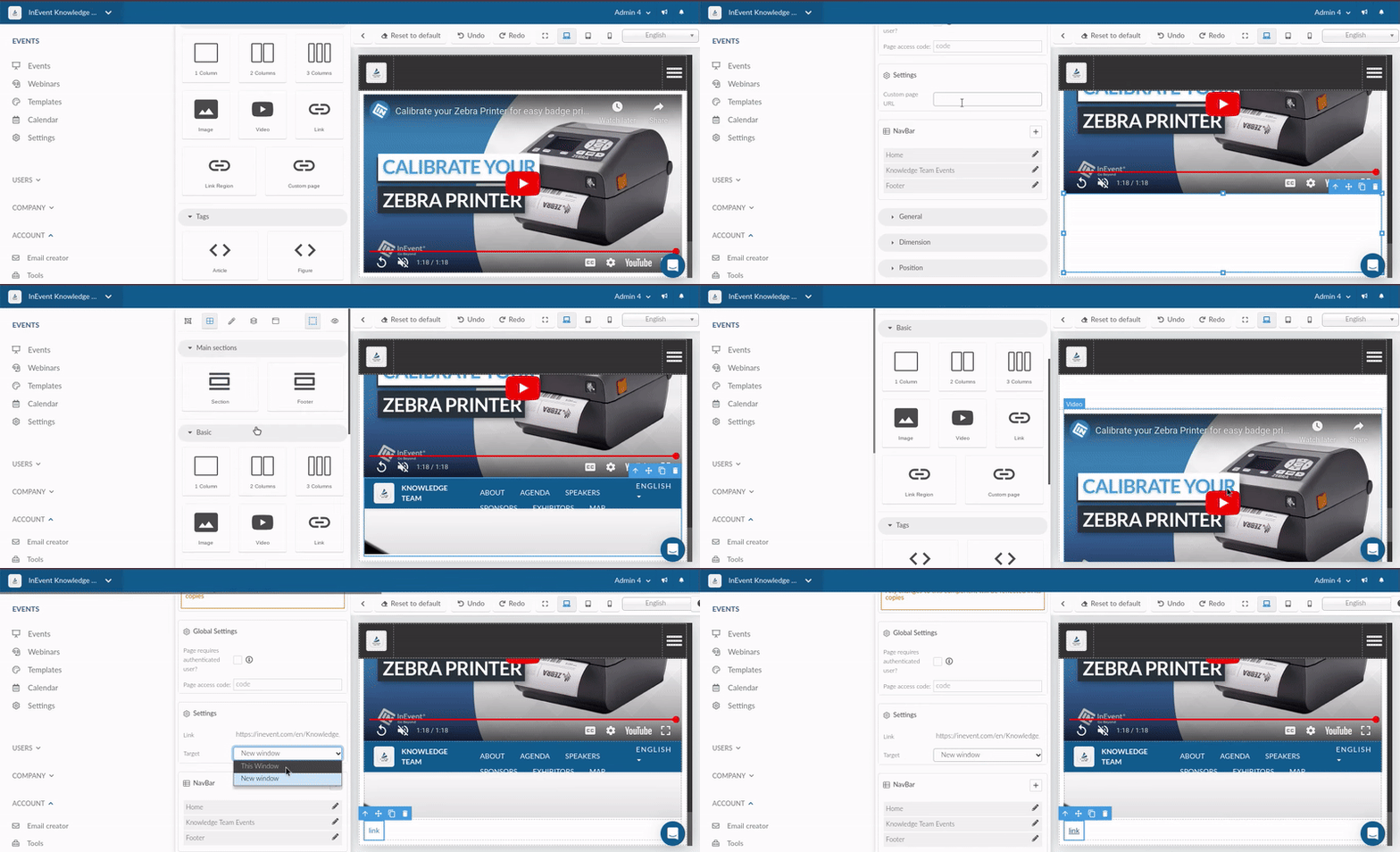
Custom page link and link settings: You can add custom pages to your directory by entering the custom page URL, which links directly to the specific pages you’ve created.
You can also add links using the link URL, enabling you to direct users to both internal and external destinations by choosing a target window.
NavBar
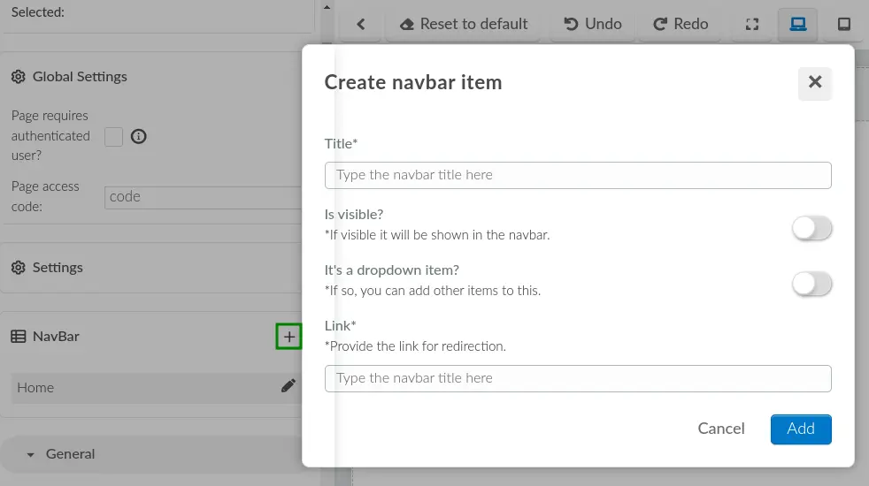
The NavBar menu allows you to add items to the directory's navigation bar by clicking on the + Add new navbar item button. Doing so will display the Create navbar item pop-up box, containing the following items:
- Title: Defines the new navbar item title.
- Is visible?: Defines the visibility rule of the new navbar item.
- It's a dropdown item?: Defines whether or not the new navbar item will be displayed as a dropdown box. If enabled, the Link field will be replaced with the Items field to add dropdown items.
- Link: Adds a link to the new navbar item.
General
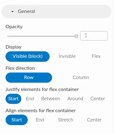
The General menu contains settings related to the selected element's opacity, display, and flex container settings.
Dimension
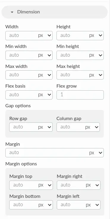
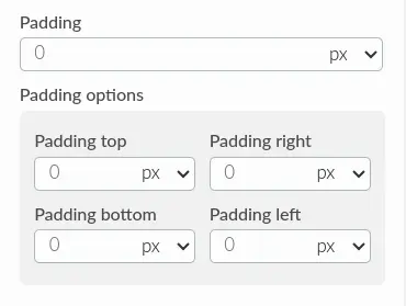
The Dimension menu contains settings related to the selected element's dimension, gap, margin, and padding, corresponding to the following CSS properties respectively: <dimension>, gap, margin, and padding.
Position
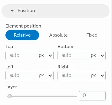
The Position menu contains settings related to the selected element's position. The available options correspond to the relative, absolute, and fixed CSS position properties. You can also further define the top, bottom, left, and right position values as well as define its layer position.
Typography
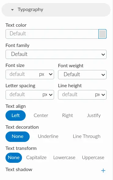
The Typography menu contains settings related to the selected element's text properties, such as font color, dont family, font size and weight, letter spacing and line height, as well as text alignment, decoration, letter cases, and shadow.
Border
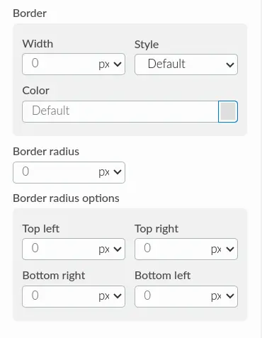
The Border menu contains settings related to the selected element's border properties, such as border width, style, and color, as well as radius.
Decoration
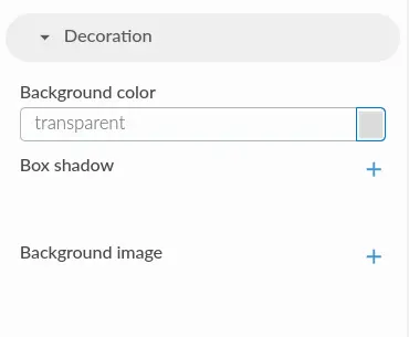
The Decoration menu contains settings related to the selected element's decoration properties, such as background color, background image, and box shadow.
Layer
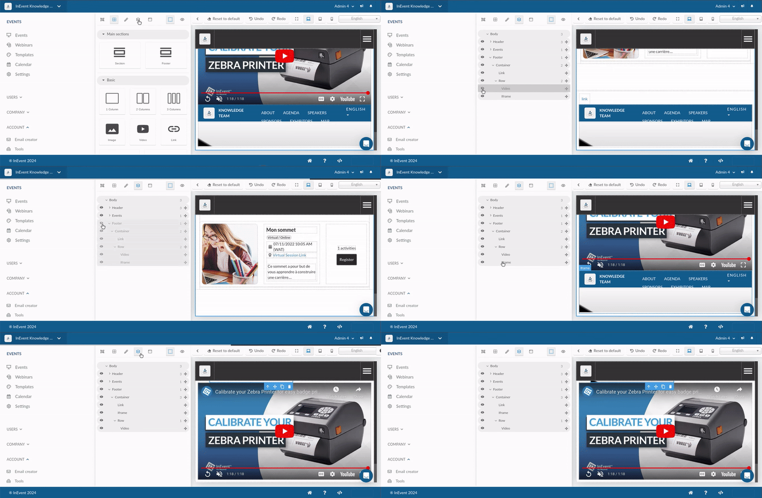
In the Layer menu, you can view and manage the layer hierarchy of your directory elements. This is especially useful when you have many elements in your directory and would like to organize them. In addition, layer hierarchy can also increase the efficiency of property styling.
You can grab a layer to rearrange its position on the directory. You can also toggle the visibility status of a layer by clicking on the eye icon on the left side of a layer.
Pages
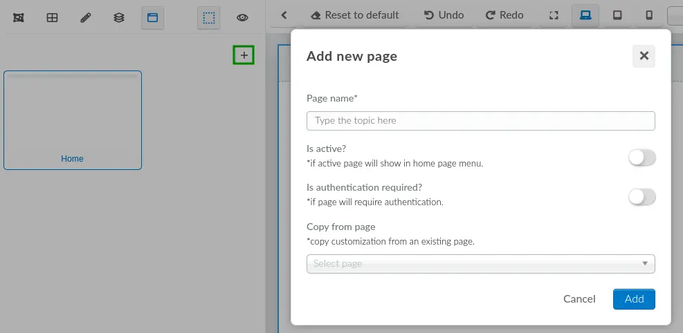
In the Pages menu, you can create, view, and manage custom directory pages. To create a new directory page, click on the + Add new page icon. Doing so will display the Add new page pop-up box, containing the following items:
- Page name: Defines the new page name.
- Is active?: Defines the active status of the page. If enabled, the page will be displayed in the directory's home page menu.
- Is authentication required?: Defines whether or not authentication is required to access the page. If enabled, only authenticated or logged in users will be able to access the page.
- Copy from page: Selects an existing custom page to copy settings and elements from.
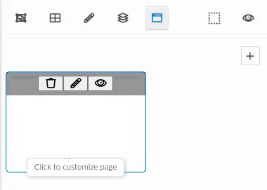
Hovering over the page thumbnail will display three buttons to Remove, Edit, and Preview the page. You can also click on the thumbnail to start editing the page.
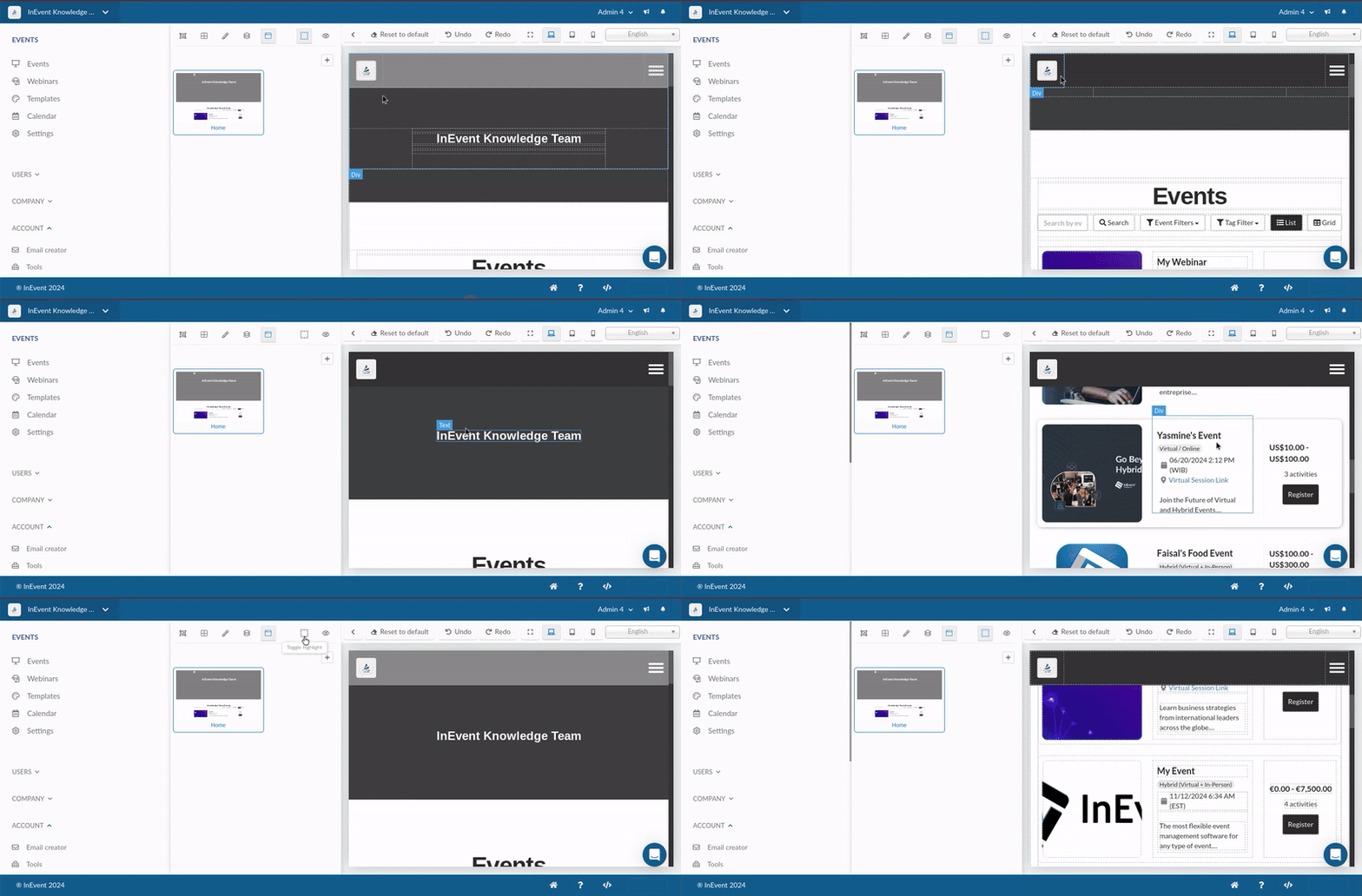
Toggle highlight
The Toggle highlight button toggles the visibility of element highlight. When the highlight functionality is enabled, elements will be displayed with dashed borders.
Preview website
Clicking the Preview website button will open the directory page in a new tab.
