Landing pages: Creating your custom website
 Updated 5 months ago
by
Caleb Kotey
Updated 5 months ago
by
Caleb Kotey
- Setting up a custom website
- Website sections
With the Landing page feature, you can build a custom website for your event. It provides you options to design and customize the website to reflect the theme of your event.
This article explains how to create, design, and customize a website for your event.
Setting up a custom website
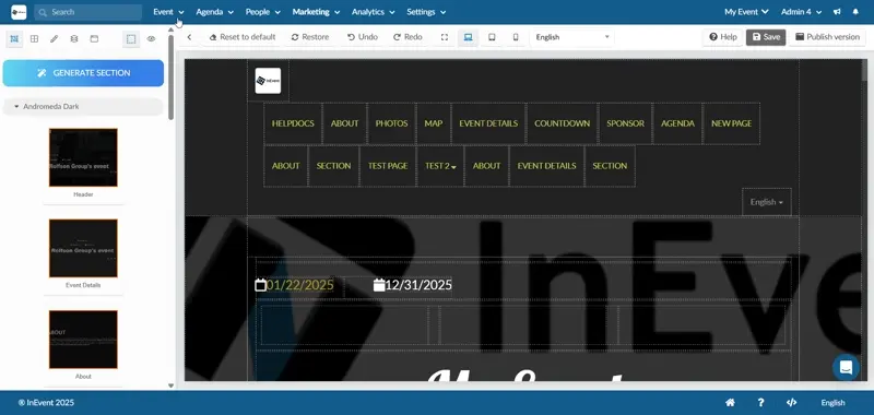
To set up your custom website, navigate to Marketing > Landing pages > Landing page.
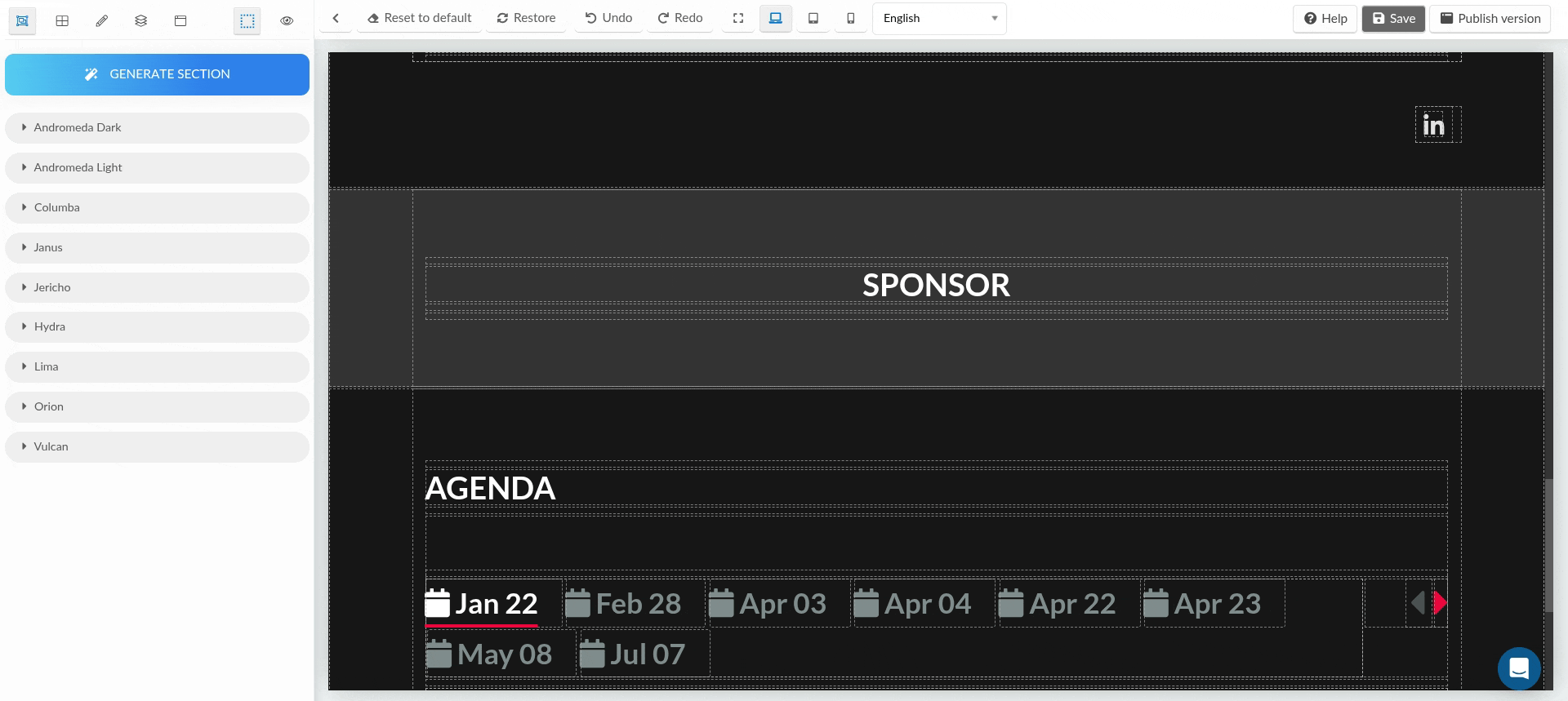
On this page, a box will appear for you to enter your page name and select a template from the drop-down. The available templates are Andromeda dark, Andromeda light, Columba, Janus, Jericho, Hydra, Lima, Orion, and Vulcan.
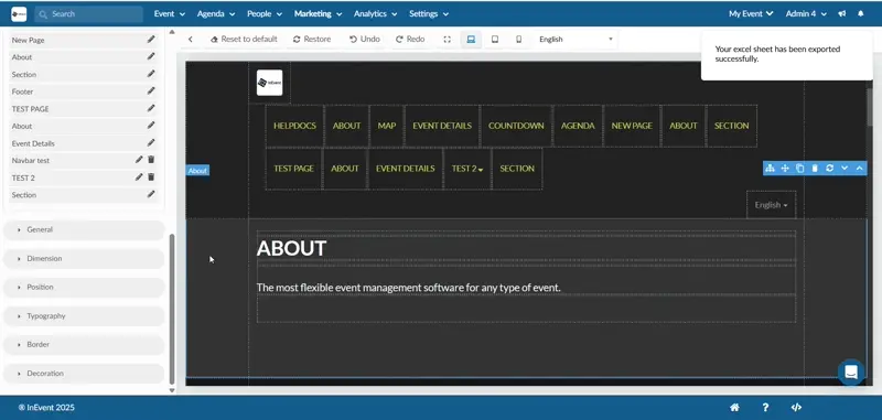
Website sections
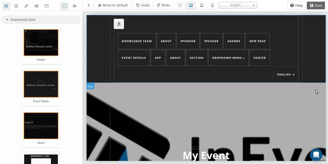
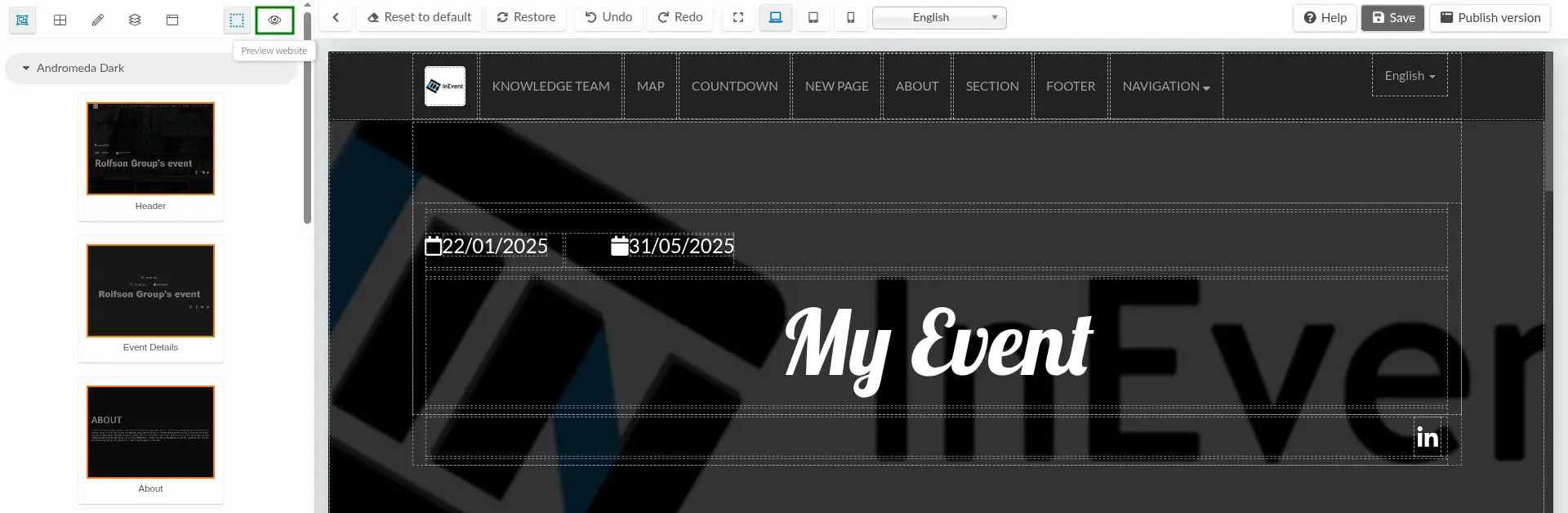
On the far left menu of the Landing page dashboard, you will see the following sections which can be added to your website:
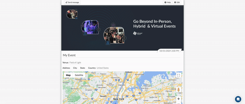
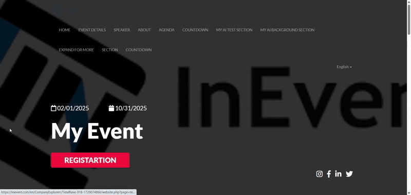
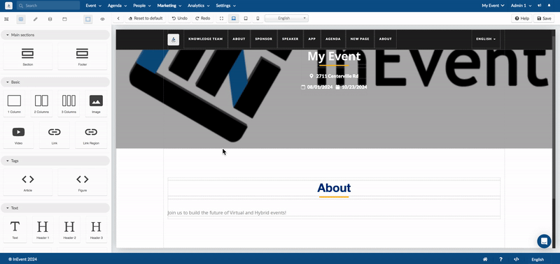
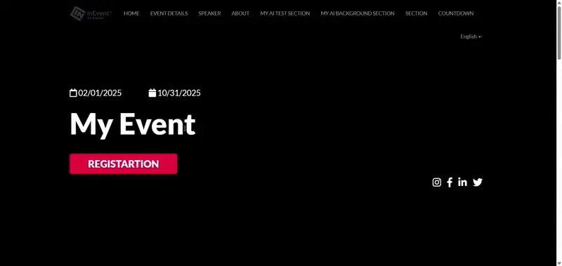
- Header: Adds the website's logo, event's name and date, event's address, city, and zip code as well as a navigation menu that shows all the available sections and allows users to navigate to different sections or pages of the site.
- Event details: Allows you to add the details of your event this includes your event's name, event start and end date, event's address, city, and zip code.

- About: Shows the event description added under Event > Details > General description.
- Registration form: Embeds your registration form to your event's website. For more information on creating a Registration form, refer to our Registration form article.
- Countdown: Shows the countdown to your event in days, hours and minutes.
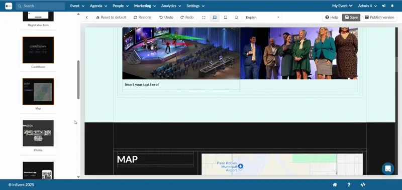
- Map: Adds a map that shows the location of your event.
- Photos: Displays the images added in your Photo Gallery.
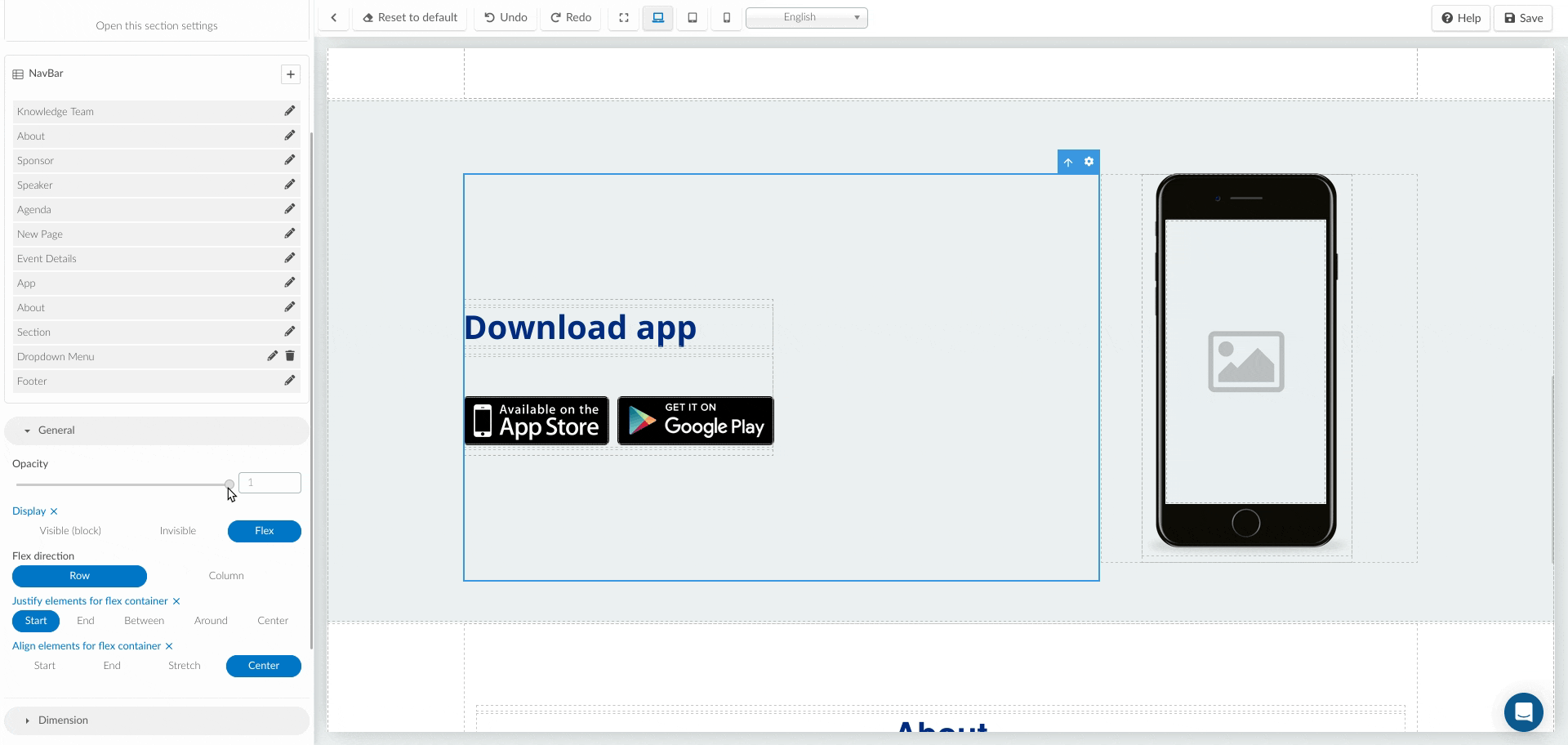
- App: Adds a section where users can download your event app.
- Sponsors: Shows all the sponsors in your event. To learn how to add sponsors to your event, refer to our Sponsors article.
- Exhibitors: Shows all the exhibitors in your event. To learn how to add exhibitors to your event, refer to our Exhibitors article.
- Speakers: Shows all the speakers in your event. To learn how to add speakers to your event, refer to our Speakers article.
- Speakers of the day: Displays speakers who would be speaking on each day of your event.
- Agenda: Shows all the activities in your event. The activity start and end times displayed on the agenda will follow the time zone selected by the event organizer under the Event > Details > Timezone.
Adding website sections
To add sections into your website, follow these steps:
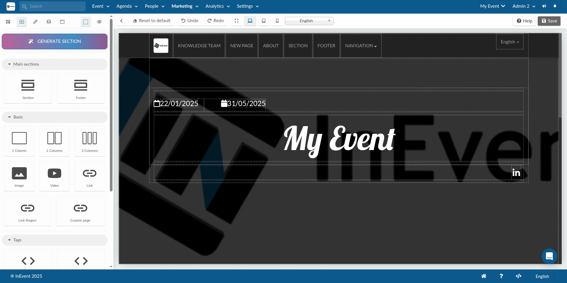
- Click on the Sections icon situated at the top left corner of the page.
- Choose the desired section from the list.
- Use the drag-and-drop functionality to position the chosen section precisely where you want it on the main page.
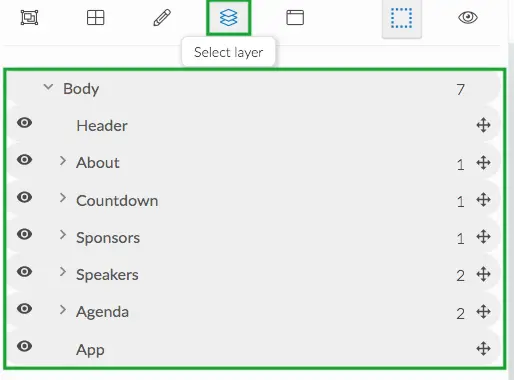
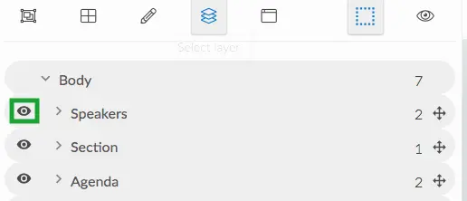
The sections you have added can also be visualized as a list. Click on the Select layer icon at the top left corner of the page. This will display all the sections available in your website. You will see the total number of sections created as well as the number of components added to each section. To access and start modifying a particular section, click on the name of section.
Advanced customizations & enhancements
Once you’ve added the website sections, you can go further with customizations to improve layout, functionality, and overall user experience.
Each section can be refined through the General, Dimension, Typography, Border, and Decoration tools available in the editing panel. These allow you to control visibility, spacing, alignment, borders, and background designs for your sections and elements.
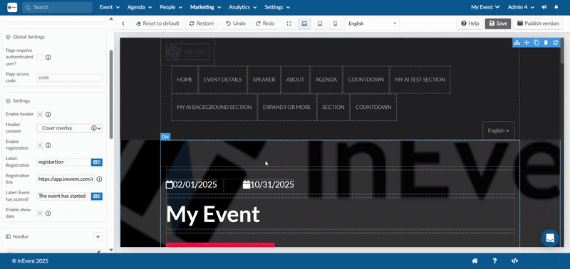
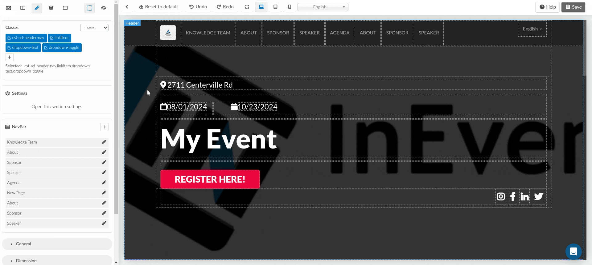
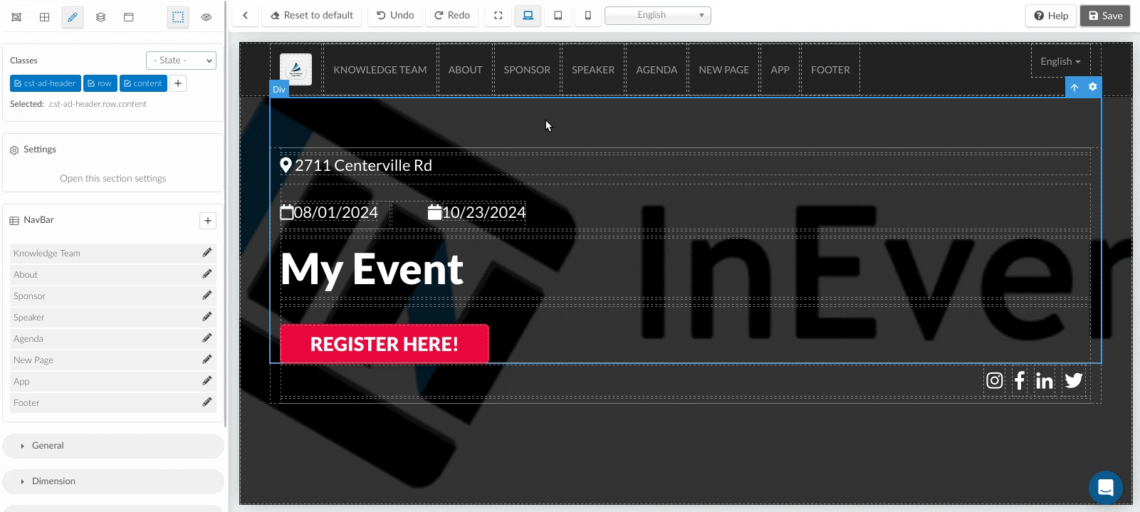
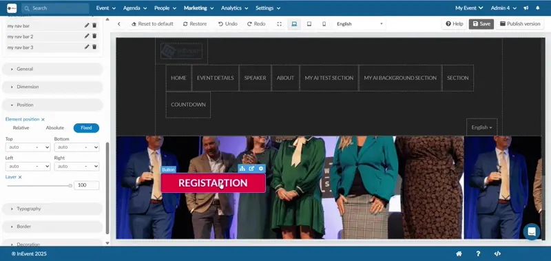
Header
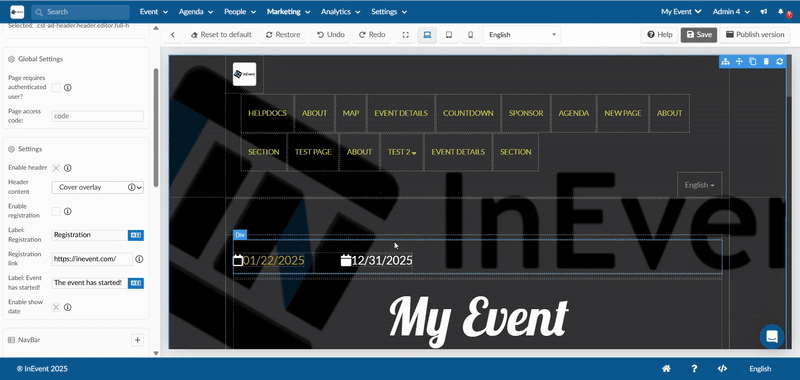
The Header section can be customized to control what content is displayed and whether a registration button is available. Some of these customizations include:
- Enable header: Turn the header section on or off.
- Header content: Choose what appears in the header(invisible or cover overlay):
- Invisible: Hides the header while keeping it available for later use.
- Cover overlay: Displays the header with a background (image or GIF) and text overlay.
- Enable registration: Allows you to display a registration button in the header. You can:
- Edit the button label
- Add a direct registration link.
- Set an alternate label to appear once the event is live
- Enable show date: Toggles the display of the event date in the header on or off.
By default, the header background uses the event cover image set under Event > Details on the platform. If you wish to change the header background, you’ll need to update the event cover image
Alternatively, you can add, remove, or edit the header background images from the Decoration section of your landing page. For more information, refer to the Decoration article.
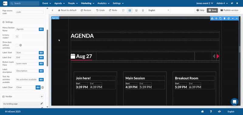
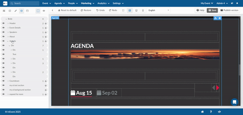
Agenda
The Agenda section is where attendees can see all the sessions, activities, and times for your event. It helps them know what is happening, when it is happening, and where to click for more details.
These are the settings and customization options available in the Agenda section:
- Menu/Section Name: This is the name that will appear in your event website’s menu (the navigation bar at the top of the page). By default, it is called Agenda. You can rename it to something more suitable, such as Schedule or Program.
- Is menu visible?: This setting decides whether the Agenda will appear in the navigation menu.
- If turned on, attendees will see Agenda (or whatever name you set) as a clickable option in the menu. If turned off, the Agenda won’t show in the menu.
- Show days without activities: If your event runs across multiple days, you can choose whether to display days that don’t have any sessions scheduled.
- Turn this on if you want all event days to be visible (even empty ones).
- Turn this off if you only want days with scheduled activities to appear.
- Label: Start: This is the word shown for when an activity begins. By default, it says Start. You can change it to Begins or whatever suits your preference.
- Label: End: This is the word shown for when an activity finishes. By default, it says End. You can change this to suit your preference.
- Button: Learn More: This is the button attendees click to see extra details about a session. By default, it says Learn more. You can change it to something like See details, View session, or Read more.
- Label: Description: This is the text label that appears above the activity’s description. By default, it says Description. You can edit this to suit your preference.
- Text: No activities available : This is the message displayed if the Agenda has no sessions. By default, it says No activities available. You can customize it to say something friendlier like Stay tuned! The schedule will be announced soon, etc.
- Label: Close: This is the text on the button attendees click to close a session details pop-up. By default, it says Close. You can customize this if you prefer.
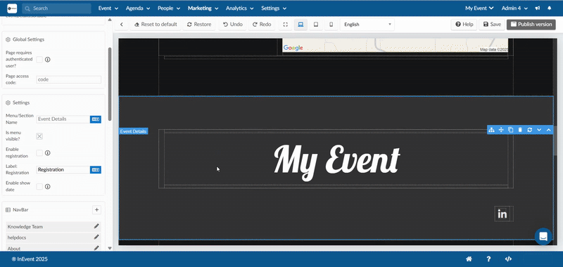
Event Details
The Event Details section is where attendees can find the key information about your event, such as its title, date, and registration options. This section helps people quickly understand the basics before exploring the rest of your event content. Customization options include:
- Menu/Section Name: The name shown in your event website’s menu.
- Is menu visible?: Toggle whether the event details section is displayed in the navigation menu.
- Enable registration: Turn on or off the option for attendees to register directly from this section.
- Label: Registration: Customize the text shown on the registration button.
- Enable show date: Choose whether the event’s date is displayed in this section.
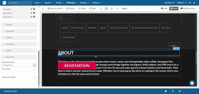
About
The About section introduces your event with a description, background story, or any key information attendees should know. You can control how this section appears and what content it contains.
Customizations include:
- Menu/Section Name: Controls how the section is labeled in your website’s navigation menu. You can rename it to match your branding.
- Is menu visible?: Toggle on/off to decide whether the About section shows up as a visible menu item. If turned off, the section will still exist but won’t appear in the menu.
By default, the About section copies the General Description set under Event > Details. If no description has been added there, the section will appear blank. However, you can always replace this with a different description or add a new one directly in the About section.
This ensures you have full flexibility, either reuse your general description or write a unique introduction just for the landing page.
Photos
The Photos section showcases images from your event. This can include official uploads, attendee contributions, or images added directly to your landing page.
Customizations include:
- Menu/Section Name: Controls how the section is labeled in your website’s navigation menu. You can rename it (e.g., change “Photos” to “Gallery” or “Event Highlights”) to fit your branding.
- Is menu visible?: Toggle on/off to decide whether the Photos section appears as a visible menu item. If turned off, the section will still exist but won’t appear in the menu.
By default, the Photos section pulls images from three sources:
- Event > Content > Photo Gallery: Any photos added here will automatically display.
- Virtual Lobby > Event Photos: Images uploaded by attendees in the Virtual Lobby will also appear in this section.
- Direct uploads to the Photos section on the landing page: These images will only display on the landing page and won’t sync back to your platform galleries.
This gives you the flexibility to combine curated event photos, attendee generated content, and landing page–specific visuals.
Registration Form
The Registration Form section allows attendees to sign up for your event on the landing page.
Customizations include:
- Menu/Section Name: Controls how the section is labeled in your website’s navigation menu. You can rename it to align with your event branding.
- Is menu visible?: Toggle on/off to decide whether the Registration Form appears as a visible menu item. If turned off, the form will still exist but won’t appear in the menu.
- Registration form link: Connects this section to a form. By default, it links to the main registration form created under Marketing > Registration > Registration Form. However, you can choose to link a different form if you prefer (for example, a speaker application or a custom form).
This gives you the flexibility to either use your event’s default registration form or link to an alternative form depending on your needs.
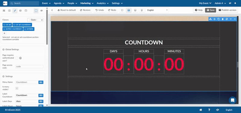
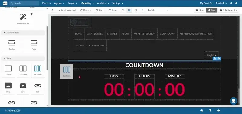
Countdown
The countdown section helps build anticipation by displaying a live timer that counts down to your event’s start date.
Customizations include:
- Menu Name: Defines how this section is labeled in your website’s navigation menu. You can rename it to match your event branding.
- Is menu visible?: Toggle on/off to decide whether the Countdown section appears in your navigation menu. If turned off, the timer will still be active on the page but hidden from the menu.
- Label: Countdown: Customize the main label
- Count up option: Switches the timer from counting down to the start of the event to counting up from the event start. This is useful if you want to show how long the event has been live.
- Label: Days / Hours / Minutes: Customize the unit labels.
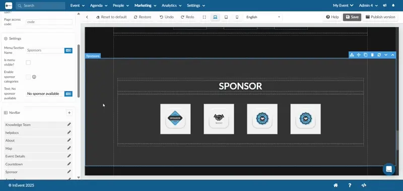
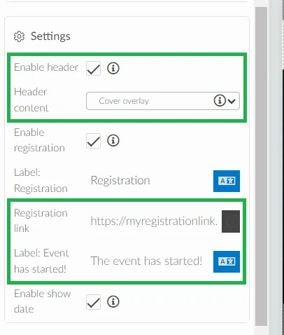
Sponsors
The Sponsors section highlights the partners and sponsors supporting your event, giving them visibility on the landing page.
Customizations include:
- Menu/Section Name: Defines how the section is labeled in your website’s navigation menu.
- Is menu visible?: Toggle on/off to decide whether the Sponsors section appears as a visible menu item. If turned off, the section will still exist but won’t appear in the navigation menu.
- Enable sponsor categories: Organize your sponsors into categories created under Event > Sponsors.
- Text: No sponsor available: Customize the placeholder text shown if no sponsors have been added yet.
The Sponsors section automatically displays sponsors you add under Event > Sponsors.
Exhibitors
The Exhibitors section showcases the companies or organizations exhibiting at your event, helping attendees learn more about them.
Customizations include:
- Menu/Section Name: Defines how the section is labeled in your website’s navigation menu.
- Is menu visible?: Toggle on/off to decide whether the Exhibitors section appears in the navigation menu. If turned off, the section will still exist but won’t be listed in the menu.
- Enable exhibitor categories: Organize exhibitors into categories created under Event > Exhibitors.
- Text: No exhibitor available: Customize the placeholder text when no exhibitors are added.
The Exhibitors section automatically displays exhibitors you add under Event > Exhibitors.
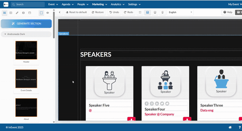
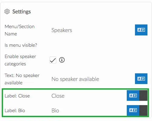
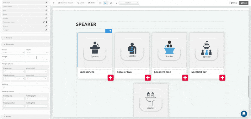
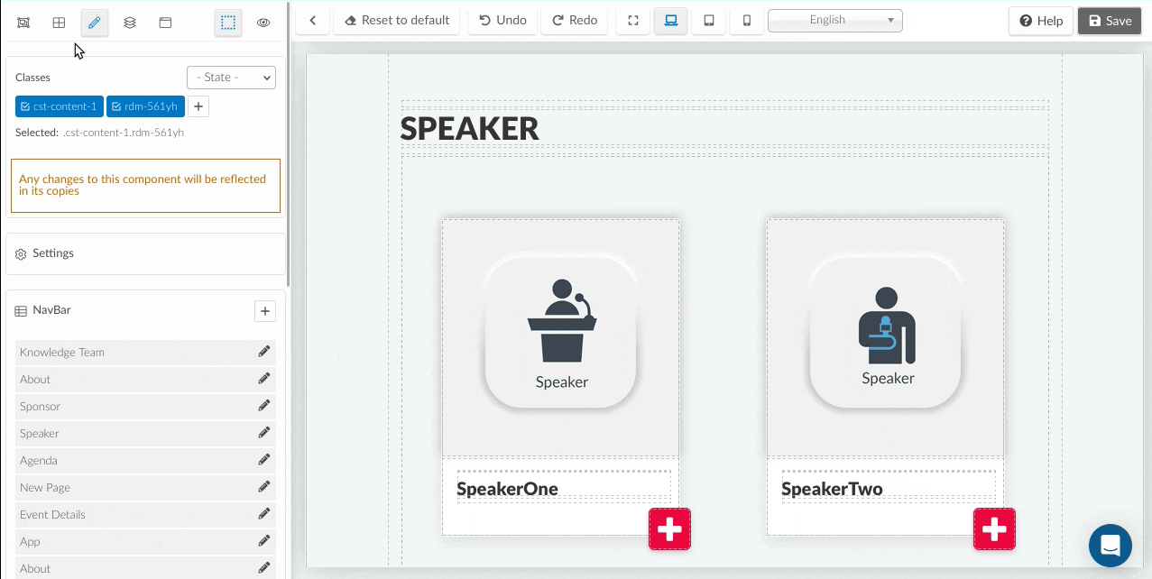
Speakers
The Speakers section highlights the people presenting or participating in your event, giving attendees insight into who they’ll be hearing from.
Customizations include:
- Menu/Section Name: Controls how this section is labeled in your website’s navigation menu.
- Is menu visible?: Toggle on/off to decide whether the Speakers section appears in the navigation menu.
- Enable speaker categories: Group speakers into categories created under Event > Speakers.
- Text: No speaker available: Customize the placeholder text when no speakers have been added.
- Label: Close: Customize the label for the close button in speaker profiles.
- Label: Bio: Defines the text label for the speaker biography section.
The Speakers section automatically displays speakers added under Event > Speakers, including their names, photos, and bios.
Speakers of the Day
The Speakers of the day section showcases only the speakers presenting on a specific day of your event. Unlike the general Speakers section, which lists all speakers, this section filters speakers by the daily agenda.
Customizations include:
- Menu/Section Name: Defines how this section is labeled in your navigation menu.
- Is menu visible?: Toggle on/off to decide whether the section appears in the navigation menu.
- Enable speaker categories: Organize daily speakers into categories (e.g., Keynotes, Panels).
- Text: No speaker available: Customize the placeholder text when no speakers are scheduled for that day.
- Label: Close: Customize the close button label in speaker profiles.
- Label: Bio: Defines the text label for the speaker biography section.
The speakers of the day section automatically updates based on your agenda. Only speakers linked to activities scheduled for that day will appear here.
Customization with Containers
All website sections in InEvent are built inside div containers.
Div containers
In short, div containers are the building blocks that give your website sections structure and flexibility. These containers, or boxes, are highlighted in blue when you hover your mouse cursor over them, making it easy to identify their boundaries while customizing your layout.
Because each section is made up of containers, you can:
- Nest content
- Layer elements
- Organize layouts using 1-column, 2-column, or 3-column structures.
- Resize and reposition elements within sections.
- Add links or tags anywhere text is supported.
When dragging and dropping elements into your website, you’ll notice several visual indicators that help guide placement.
Yellow highlight: Shows a container where the element can be placed.
Green line: Indicates the exact position where the element will be inserted.
No yellow highlight: Means that the element cannot be placed inside that container.
These visual cues make it easy to understand where elements fit within the layout and help you build your website with confidence.
Once your elements are inside a container, you can refine their look and layout using the editing options on the left-hand panel. These include:
- General settings (opacity, display, flex alignment)
- Dimensions (width, height, margins, padding)
- Typography (text color, font, spacing, shadow)
- Border (style, radius, color)
- Decoration (background color, image, shadows)
For a full walkthrough of these tools, refer to the sections on General, Dimension, Typography, Border, and Decoration.
Viewing your containers as a list
You can view and manage all the containers and components within your website sections in a structured list format. Click the Select layer icon at the top-left corner of the page, and a list will appear showing all the sections on your website (for example, Event Details, About, or Speakers). Each website section displays the total number of components inside it, and you can click the arrow beside a section to expand it and see which components, such as text, images, or columns, are nested within others.
When expanded, containers in a section will be displayed as Divs. Once you place or insert a component such as text, image, or video, into a div or container, that element will appear within it. This helps you visualize the content hierarchy clearly.
This view helps you manage your page’s structure more intuitively, making it easier to organize or rearrange nested elements visually.
Backgrounds and Layering
In the landing page editor, you can enhance your layout by assigning background images or GIFs to containers, columns, or boxes. This feature allows you to visually layer text, buttons, or other elements above backgrounds, creating depth and structure within your design. You can:
- Add a background image or GIF to any container, column, or section through the Decoration settings.
- Nest text, links, or other elements within these containers so they appear above the background.
Column Structure and Layout
Column components (1-column, 2-column, or 3-column) let you organize and align content within your page sections. They act as containers that divide a section into structured layouts, allowing for side-by-side or stacked arrangements. You can:
- Insert column components from the Components section.
- Resize columns or adjust spacing using the Dimension, Position, Padding, and Border settings.
- Nest additional components inside columns, such as text, images, or buttons.
- Combine multiple column elements to build flexible, layered structures.
By understanding how columns work, you can easily manage the placement of content and ensure that your layout adapts smoothly across screen sizes.
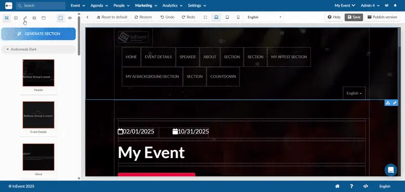
Creating custom sections for your website
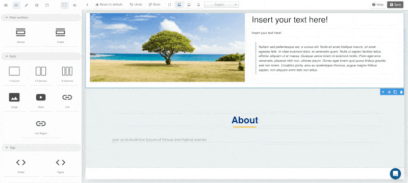
When you click on the Components icon at the top left corner of the page, you will have the possibility of creating your custom sections using the available tools. You will be able to create extra sections with text content, images, and links. On this page, you will find the following fields:
Generate custom sections automatically using AI
The AI-powered website section generator lets you upload a screenshot of any website, and it automatically creates a custom section based on that image as well as any additional instructions. You can then edit and modify the section as needed. This greatly saves time when building custom sections or pages.
To use the AI-powered section generator, follow the steps provided below:
- Click the Generate section button at the top of the Sections or Components tab. The Generate new section using AI pop-up box will be displayed.
- Upload a screenshot of any website part of section you want to replicate using the file selector or by dragging and dropping the image. This step is recommended for best results. The following screenshot is used as an example in this guide.
- Enter the Section name. This step is required.
- Write a description of the section, including any instructions or extra details in the Describe the section you want to generate text field. This step is required.
- Click Generate. The AI will process the request, and the resulting custom section will appear under Custom sections.
After completing the steps above, your generated Custom section can be immediately dragged and dropped to your website page and further edited to suit your styling needs.
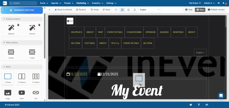
Main section
In the Main section, there are two available options: Section and Footer. You can add a Section and Footer by dragging and dropping the selected option into the main page.
Basic
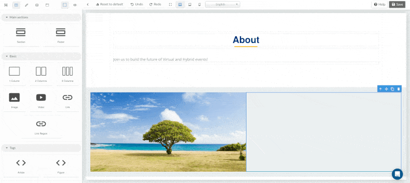
From the Basic section, the available options are: 1 column, 2 columns, 3 columns, Image, Video, Link, and Link region. You can drag and drop any of these options into the Section or Footer selected from the Main section.
- When adding a column, simply drag and drop it into the added Section or Footer.
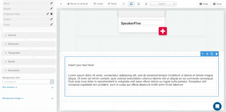
- To add an image, select it from your computer or drag and drop it into the designated Section or Footer. Click on the uploaded image to add it. You can adjust the image size using dimension Width and Height, and include Alt text in the Settings field at the left hand menu of the page.
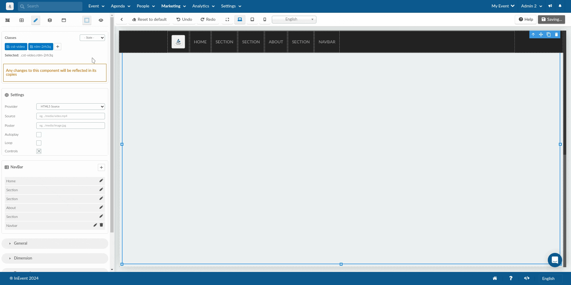
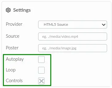
- To add a video, click on the video element and click on the pen Click to edit style icon on the top left menu. In the Settings section, you can use the drop-down box to select the desired video provider: HTML5 Source, Youtube, Youtube (no cookie), or Vimeo. You can also use the checkboxes to enable or disable video Autoplay, Loop, and Controls.
- When adding a Link or Link region, click on it and its Settings menu will open at the left corner of the page. Here you can insert the link's URL in the Link text box and select its Target to decide if the link should open in a new window or the website page will be directed to the link's page: This window or New window.
Tags
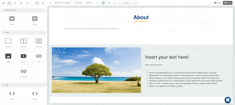
In the Tags section, the available options are Article and Figure. To add any of these options, drag them into the Section or Footer column.
Text
In the Text section, the available options are Text, Header 1, Header 2, Header 3, Header 4, and Quote. These options allow you to write inside the text boxes. You can also use HTML-formatted text or other elements.
To add any of these options, simply drag and drop it into the Section or Footer sections added. You can also add any of the text options inside Columns, Article, Figure options.
Reordering sections
To reorder sections on the website, follow the steps below:
- Locate and click on the section you want to re-position.
- Click on the Settings icon to display the available options.
- Click on the Drag and Drop icon.
- Drag the section to the desired position and drop.
Alternatively, you can re-order your sections by clicking on the Select layer icon at the top left corner of the page.
Here you will see a list of the added sections. To re-order the sections, click on the drag and drop icon beside a section and drop the section in the desired position. You will see the changes reflect in the section menu of the main page.
Icons on the Landing page
When you click anywhere on a component added on the landing page builder, you will be able to see some icons as shown bellow. The icons shown below (from left to right):
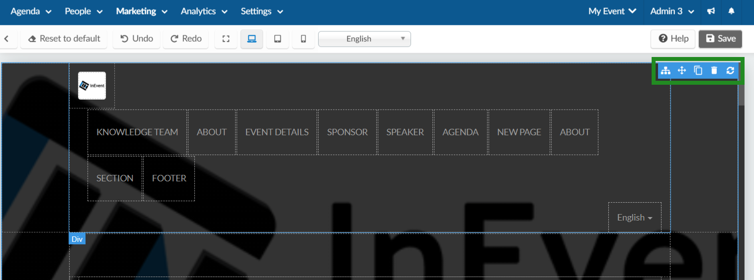
- Parent container: This is used to select the parent container of the component you are in. It moves one level up until it reaches the highest component.
- Compass-like cross: This is used to move the component.
- Copy Icon: This is used to create an exact copy of the component selected.
- Delete icon: This is used to delete/remove the component selected.
- Refresh icon: This is used to reload or update the component selected
Creating a dropdown menu for your sections
To create a dropdown menu for your website sections, follow these steps:
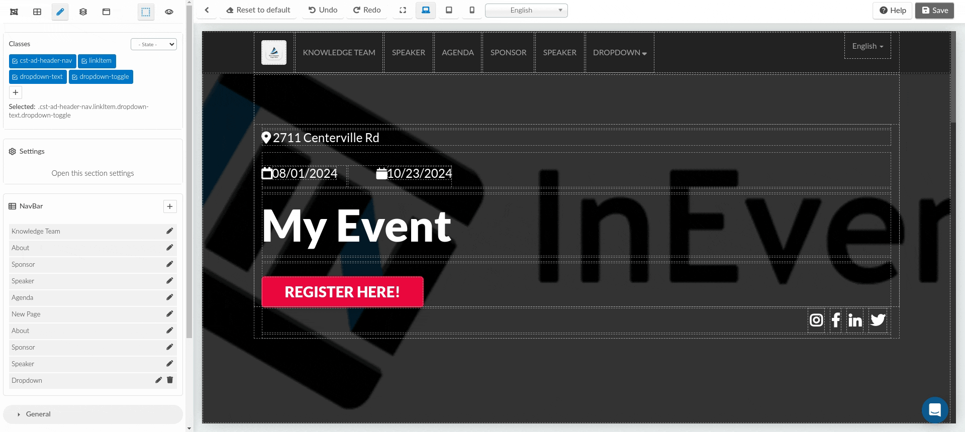
- Click on the pen icon located at the top left corner of your webpage.
- Next, click on the + icon beside NavBar.
- In the box that appears, fill in the following information:
- Title
- Is visible?: Enable the visibility of the dropdown menu by toggling its button.
- It's a dropdown item?: Enable this option to add sections to the dropdown.
- Items: When the It's a dropdown item option is enabled, you can add the desired sections by clicking on the Select some options box.
- Link: If you disable the It's a dropdown item option, you can add a link here.
https://.- Click on Add once you have configured the settings.
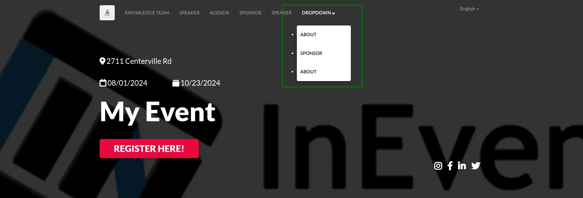
Once created, the dropdown will appear in the top bar of your page and on the top menu bar of your website page.
In the website page, the created dropdown menu will appear in the top menu bar. When clicked, it will display the added sections, allowing for easy navigation to a selected section.
Editing the dropdown menu
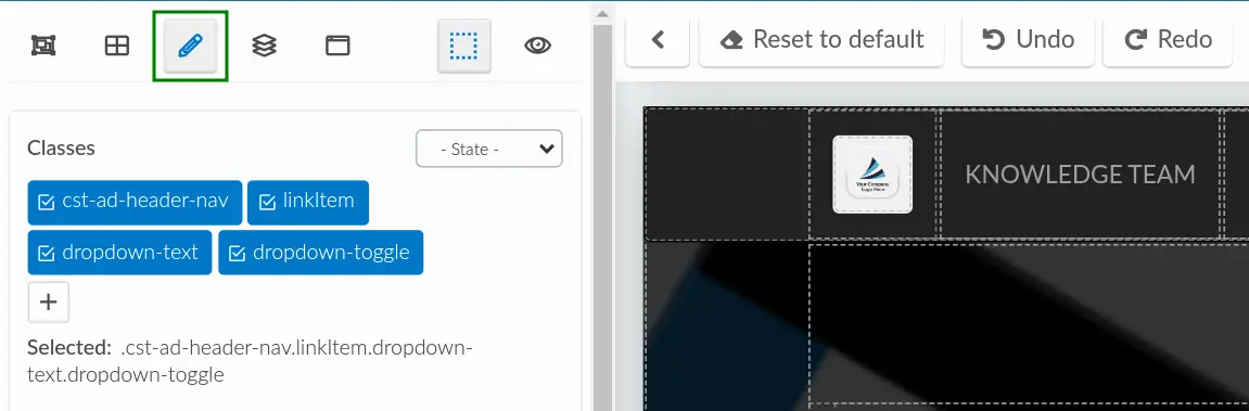
To edit the dropdown menu, follow the steps below:
- Click on any part of a section on the main screen.
- Click the editing pen icon next to the created drop down
- In the box that appears, you can:
- Change the title of the drop-down.
- Modify the visibility.
- Add more sections.
- Remove a section by clicking the X icon beside it.
- Add a translation to your title.
- Turn off the It's a drop down item to add a link or turn it on to add sections.
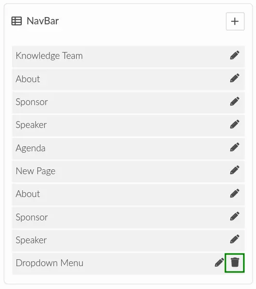
Deleting the dropdown menu
To delete the created dropdown menu, simply click on the trash icon next to it and it will be removed. All the sections will then appear individually at the top menu bar.
Customizing sections
There are so many customization options that you can carry out on your sections. To begin editing a section, simply click on the section you want to edit, and the editing menu will open at the left side of the page.
Settings
From the editing options, click on the Open this section settings button and the settings option available for customization will appear. You can do the following actions:
- Change the section's name.
- Make the section visible or invisible on the website's menu by checking or unchecking the Is menu visible? checkbox
- Add translations to your sections' names and other texts.
- Customize label names based on the selected section.
When editing the Header and Event details section, you will be also be able to configure the following fields:
- Enable registration: When ticked, it will add a Registration button that will lead whoever accesses the website to the Registration form when clicked on.
- Label Registration: Here you can edit the name of the Registration button.
- Enable show date: This is enabled by default. You can untick the checkbox to hide the event's start and end date that appears in your Header and Event details sections.
When editing just the Header section, you will see the additional options:
- Enable Header: This is enabled by default. Tick or untick the checkbox to make the header will be visible or invisible on the website.
- Header content: This is by default set to Cover overlay. You can change it to Invisible using the dropdown, and the details on the header will be cleared.
- Label: Event has started: You will be able to change the 'event has started' message that appears when using the Lima template when the event has already begun.
- Registration link: This field appears when editing the Header section, you will be able to add a registration link.
When editing the Sponsors, Exhibitors, and Speakers section, you will also be able to do the following actions:
- Enable categories by ticking the checkbox.
- Change the text that appears on the website when there is no Sponsors, Exhibitors or Speakers available.
When editing the Speakers section alone, you will also be able to change the Bio and Close labels that appears when viewing a Speaker on the website.
General
From the editing options click on General. You will be able to carry out the the following modifications to a selected section or a part within the section using the following tools:
- Opacity: Use the regulate button or click on the up or down arrow to define the section's opacity.
- Display: Choose between the visible, invisible, flex buttons to define how the section should be displayed.
- Flex container: Enable or disable the flex container.
- Justify elements for flex container: Click on the box within your section to reposition the elements using the Start, End, between, Around, Center options.
- Align elements for flex container: Click on the box within your section to reposition the elements using the Start, End, Stretch and Center options.
Dimension
From the editing options, click on Dimension. You will be able to carry out the the following customization to a selected section or a part within the section using the following tools:
- Width and Height: When working with sections containing images, you can customize the width and height of the images. You can either input the numerical value or make use of the arrow buttons beside the box to increase or decrease the width and height measurements.
- Margin: Set a margin for your section by either inputting a numerical value in the box or using the arrows beside the box to increase or decrease the margin. The margin can be set in pixels (px) or in percentage (%). You can also use the Margin top, Margin right, Margin bottom and Margin left options to set the margins for specific sides of the section.
- Padding: To create spacing within your section, you can set a padding. You can type in the numerical value or use the arrows next to to the box to define the padding. The padding can be set in pixels (px) or percentage (%). You can also use the Padding top, Padding right, Padding bottom and Padding left options to define the padding for specific parts of the section.
Position
From the editing options, click on Position. This controls how the section or element is placed on the page.
Relative: Keeps the element in the normal layout flow but lets you nudge it slightly from its original position using top, left, right, or bottom values. Think of it like moving a box a few pixels up, down, or sideways without disturbing the overall structure.
Absolute: Removes the element from the normal layout flow and positions it relative to its closest parent container. This is useful for creating layered designs, for example, placing text over an image or button exactly where you want it.
Fixed: Locks the element in place relative to the browser window instead of the page. Even when you scroll, the element stays visible, perfect for sticky headers, floating buttons, or banners that stay on-screen.
Layer: Defines the stacking order of elements when they overlap. Increasing the layer value brings an element forward, while decreasing it sends it behind other elements. This is useful when layering text over images or videos for design clarity.
You can define placement using Top, Bottom, Left, and Right values. These can be set in units like px, %, rem, or vh for responsive control.
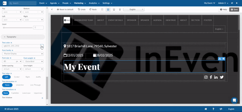
Typography
This section appears only when you have clicked on a text within a section. You will be able to carry out the following customization to texts:
- Text color: Pick a color for your text using the color board.
- Font family: Choose a font for your text using the drop-down menu.
- Font size: Define the size of your text by either entering a numerical value or using the arrows beside the box to increase or decrease the font size.
- Font weight: Select a specific font weight for your text using the drop-down menu.
- Letter spacing: Adjust the spacing between each letter by entering a numerical value or using the arrows beside the box to increase or decrease spacing.
- Line weight: Set the thickness of the lines in your text by entering a numerical value or using the arrow buttons to adjust the weight.
- Text align: Align your text horizontally using the Left, Center, Right, or Justify options.
- Text decoration: Choose between Underline to underline your text or Line through to strike through your text. Click None if you do not want to apply any of these options.
- Text transform: Change the case of your text using the Capitalize, Lowercase, or Uppercase options. Click None if you do not want to apply any of these options.
- Text Shadow: Click on the + sign to open a new field for customizing text shadows. Enter numerical values in the X and Y columns to set the horizontal and vertical dimensions of the shadow. To blur the shadow, input a numerical value in the Blur box. Select a Color for the text shadow using the color board.
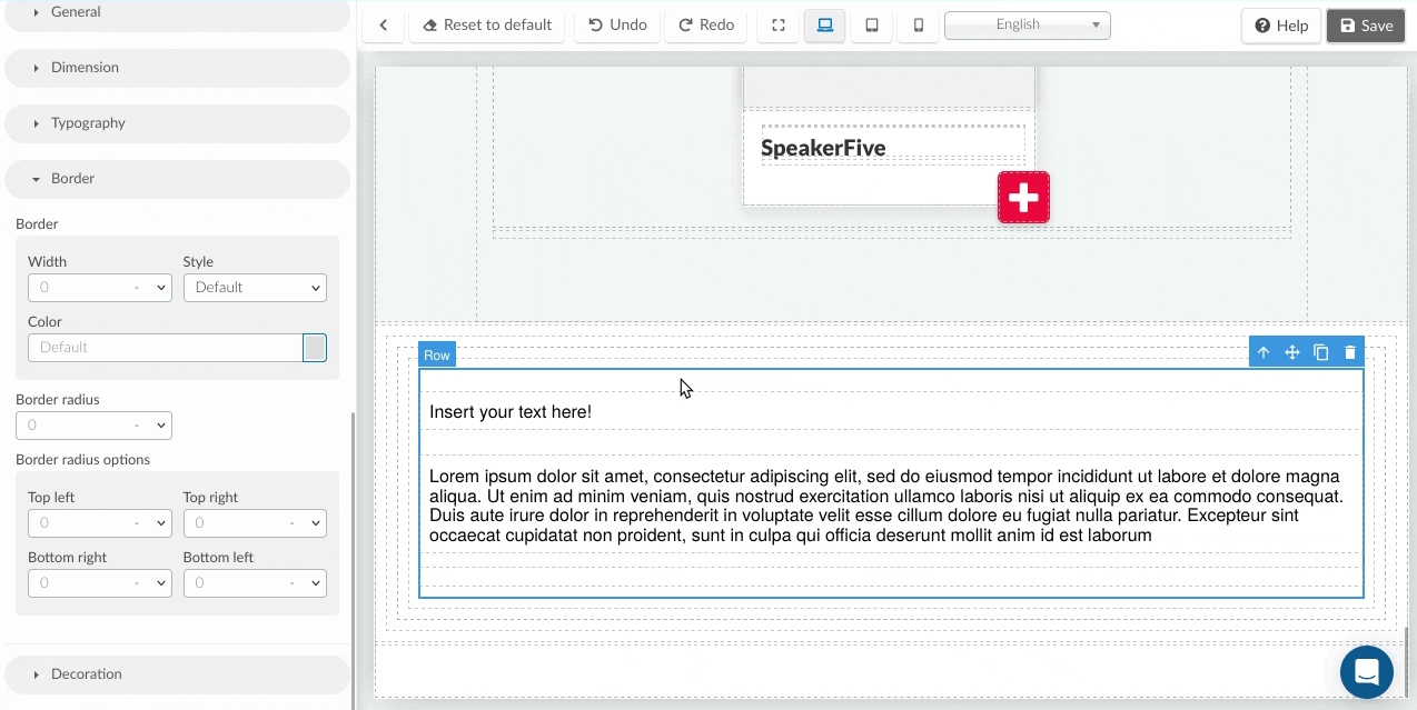
Border
From the editing options click on Border. You will be able to carry out the the following customization to a selected section or a part within the section using the following tools:
- Width: Set a width for your section's border by either inputting the numerical value in the box or using the arrows beside the box to increase or decrease the border's width.
- Style: Set the style for your border by selecting from the drop-down menu the style of choice.
- Color: Choose a color for your border's style.
- Border radius: Set a radius for your section's border by either inputting a numerical value in the box or using the arrows beside the box to increase or decrease the radius. The radius can be set in pixels (px) or in percentage (%). You can also use the Top left, Top right, Bottom right and Bottom left options to set the radius for specific sides of the section.
Decoration
From the editing options click on Decoration. You will be able to carry out the the following customization to a selected section or a part within the section using the following tools:
- Background color: Add a background color using the color board.
- Box shadow: Click on the + sign to open a new field for customizing the box shadow. Enter numerical values in the X and Y columns to set the horizontal and vertical dimensions of the shadow. To blur the shadow, input a numerical value in the Blur box. To spread the shadow, input a numerical value in the Spread box. Select a color for the text shadow using the color board. Using the Type drop-down, select whether the shadow should be Outside the box or Inside the box.
- Background Image: Click on the + sign to open a new field. Here you can add a background image to a section by clicking on the Images button under Select image. To remove the image simply click on the x button beside the image in the customization field. You can make further customization to the image using the Repeat, Position, Attachment, and Size fields, simply click on the drop-down beside each field to choose your preferred choice.
Understanding measurement units
When customizing your website layout in editing options like Dimension, Typography, Border, and Decoration, you’ll encounter various units that define spacing, sizing, and positioning.
px (pixels): This is a fixed, absolute unit that doesn’t change based on screen size or zoom level. It’s great for precise control, such as aligning elements exactly or setting small, consistent gaps. However, it’s not ideal for responsive designs since it doesn’t scale automatically.
% (percentage): This is a relative unit based on the size of the parent container. It scales automatically, making it perfect for responsive layouts that adjust to different screen sizes. For example, setting left: 50% moves the element halfway across its parent container.
rem (root em): This unit is relative to the root font size of the page. It helps maintain consistent spacing and sizing across your entire site. If a user changes their browser’s base font size, any element using rem will scale accordingly.
vh (viewport height): This is a responsive unit based on the height of the browser window (the viewport). One vh equals 1% of the total screen height. It’s ideal for full-screen sections, banners, or centered layouts that adapt to any device size.
Embedded video
After adding an embedded video element, you can configure it to display a video from an HTML5 Source, Youtube, or Vimeo. Select the target provider using the Provider drop-down box.
When HTML5 Source is selected, enter the direct link of the target video, such as https://path/to/video.mp4, in the Source field. In addition, you can also use a separate thumbnail video by entering the direct link of the thumbnail image in the Poster field.
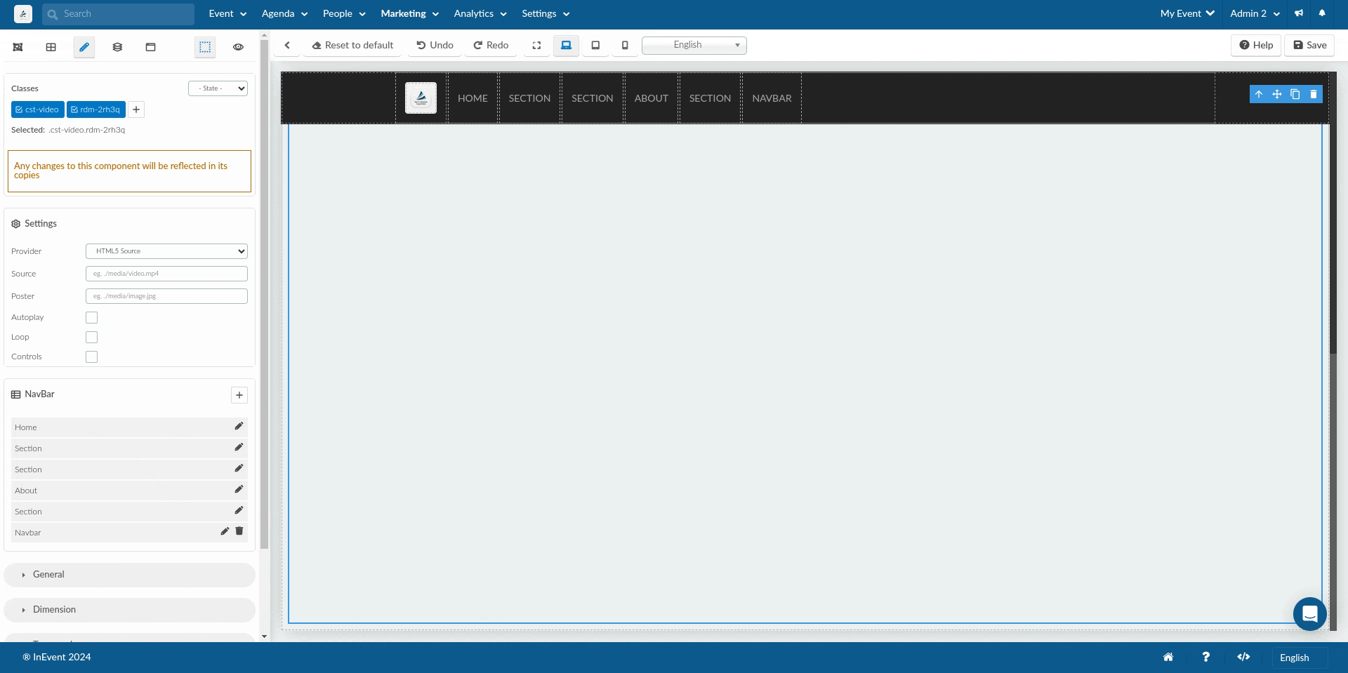
When Youtube or Youtube (no cookie) is selected, enter the Video ID found in the URL, such as GImv597rQ8U, in the Source field.
When Vimeo is selected, enter the Video ID found in the URL, such as 288344114, in the Source field.
You can resize the embedded video using the square icons around the video element.
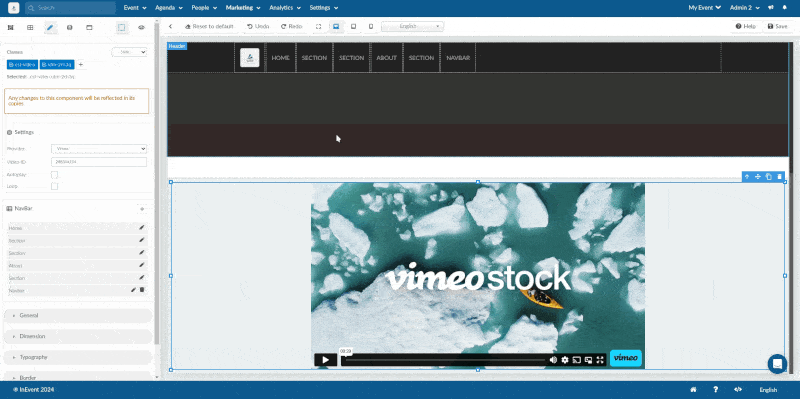
You can also enable or disable Autoplay, Loop, and Controls using the checkbox items.
Removing a section
To remove a section, first click on the section. When you do so, a blue trash can icon will appear and once you click on the icon, the section will be instantly deleted.
Making the logo on your landing page clickable
You can set your landing page logo to redirect users to a specific URL when clicked. This is great for navigation or linking back to your main site. To do this, follow the steps below:
- Navigate to Event > Details.
- Scroll down to the Advanced section.
- Select Links and domain.
- Click on Edit.
- In the Website link field, enter the URL you want users to be redirected to when they click the website logo.
- Click on End to save changes.
This allows you to link your logo to an external site or any page you'd like to direct attendees to.
Switching templates
You can easily switch templates. To do this simply navigate to the Sections page which displays the templates in alphabetical order. Scroll down to see all available templates and sections within them or simply click the arrow next to the first template to reveal the other templates, and click on the template to see the available sections.
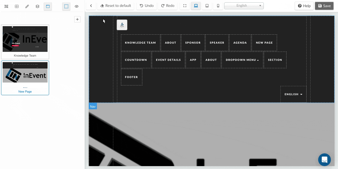
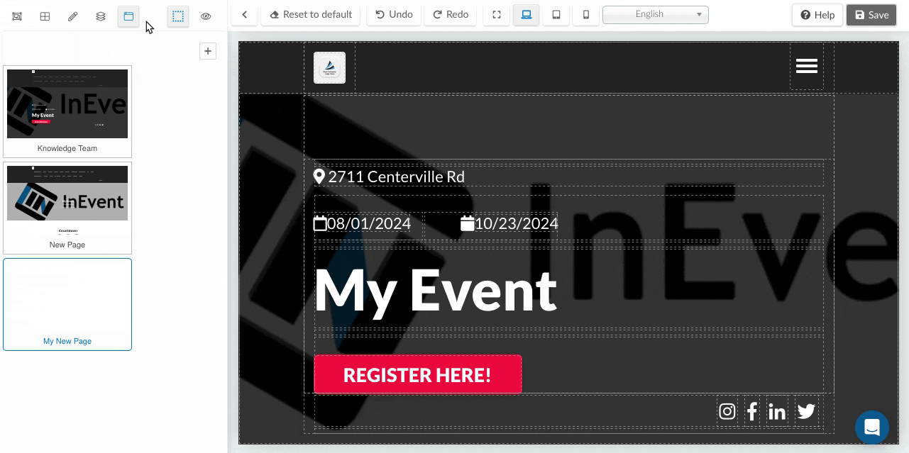
Adding new website pages
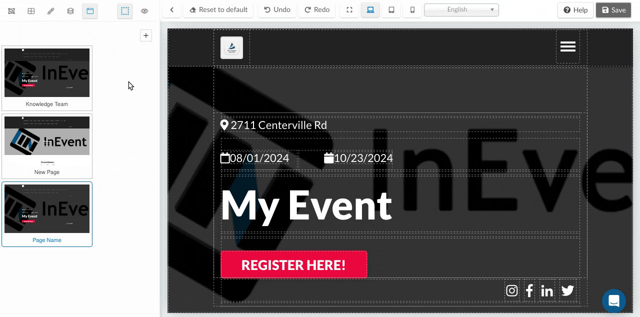
To add new website pages, click on Click to manage pages icon, and then click on Add new page. Fill in the following information:
- Page name: Title of your page.
- Is active?: If you want the page to appear in the menu bar of the home page toggle the switch button on.
- Copy from page: Select from the drop-down menu an existing page whose customization you want for your new page.
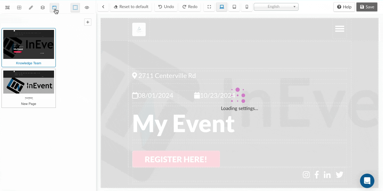
Once you have created the new website page, you can start adding sections and new component to the page.
Editing website pages
After creating a website page, you can easily edit this page. To do this, go to the Click to manage page and hover over the page you want to edit. Here you can change the name of the page, set the page to active or not, and add translations for your page's name, then click on Save.
Deleting website pages
To delete website pages, go to the Click to manage page, hover over the page you want to delete and select the trash bin icon. Click Yes on the confirmation pop-up that appears and the page will be removed.
Previewing the website
To preview your website, simply click on the eye icon located at the top left corner of the page. It will open the Home page of the website in a new tab. You will see all the created sections and pages on the top menu bar. You can click on the different sections and website pages that you've created and it will redirect you to each corresponding section or website page for a comprehensive preview of your content.
Choosing a view while building the website
You have the flexibility to select from a range of view options located at the top of the page. These options include Expanded view, Desktop view, Tablet view, and Mobile view. This allows you to tailor your website's appearance to various devices and screen sizes.
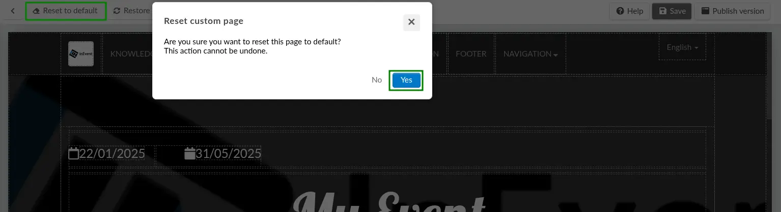
Resetting the website page
You can reset the website page back to its default state by clicking on the Reset to default button at the top of the page. Additionally, you have the option to use the Undo button to remove an action or the Redo button to bring back an action if necessary.
Saving, publishing and restoring the website
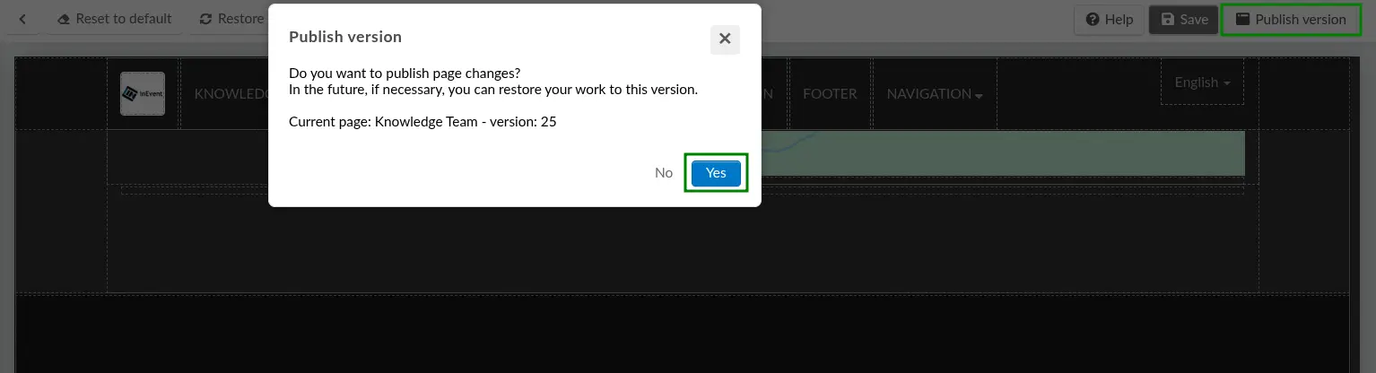
The platform automatically saves changes to the website, but does not automatically publish it. To publish the website, click on Publish version on the top right menu. The Publish version confirmation pop up window will be displayed, complete with the publish candidate version number. Click Yes to publish the website, and the live website will be updated to the most recent version.
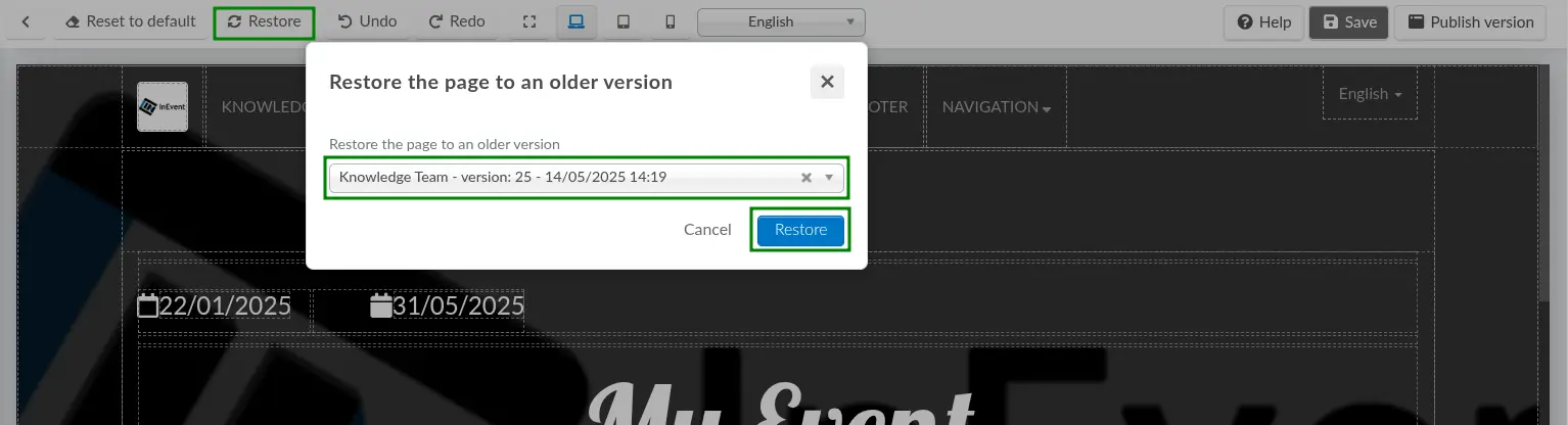
The website can also be restored or rolled back to a previous published version. Click Restore, and the Restore the page to an older version pop-up window will be displayed with a drop-down box of existing website versions. Click the desired version and click Restore.
Click Yes on the confirmation pop-up window.
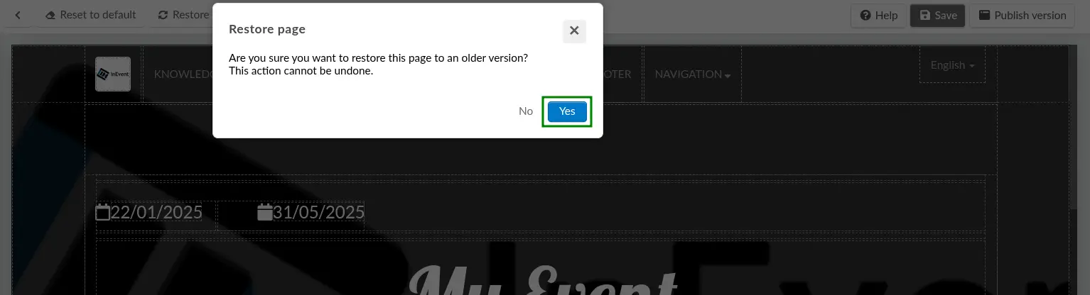
After completing the saves above, the website in the editor will be restored to the desired version. To update the live website, ensure to click Publish version and complete the confirmation step, which also bumps the website version number. Then, the live website will be updated.
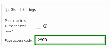
Defining website authentication policy and access code
The website can be configured to require authentication or access code to be viewed. The options can be configured under the style editor's Global Settings panel.
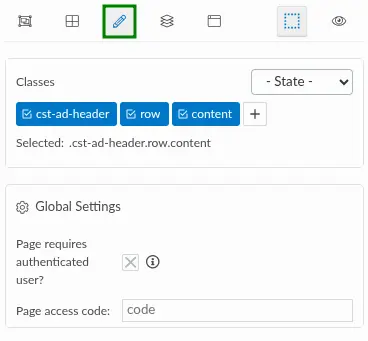
Authentication requirement
If the Page requires authenticated user? box is checked, people accessing the website page must already be registered for the event. When unauthenticated users access the website page, they will be prompted to log in using their username and password. Then, after logging in, they will be redirected to the website page.
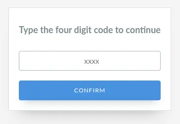
Page access code
Event organizers can define a four-digit code to secure website pages, allowing the website to be viewable to only users who have access to the code.
To activate the page access code, enter the desired four-digit code in the Page access code field. Then, save your changes.
After doing so, the website page will prompt the user to enter the four-digit code upon accessing the page link.